I experienced Detroit's North Terminal this week, and here's a report.
Saturday, October 22, 2016
Tuesday, May 13, 2014
United's new Terminal B space
at BOS: Some first impressions

You don't get a second chance to make a first impression. That's what I was thinking on Friday, May 9 when I arrived at the just-opened Terminal B space, new home of United Airlines at Boston's Logan Airport.
By "just opened," I mean 10 days earlier. Wow! I had no idea this transition was taking place when I booked my flight to San Francisco last month, and only learned of it through mainstream news reports. So I was eager to check it out.

Prior to the United-Continental merger in 2010, United was a long-time occupant of Terminal C going all the way back to pre-dereg days. As a kid in the 1970s, I would go up to the old control tower's observation deck (long-since closed), and a highlight was watching United's morning non-stop to San Francisco, usually a 747, pull back from C gate right in front of us.
At Logan, Continental and predecessors such as People Express didn't have nearly that kind of pedigree. The carrier bounced around over the years, finally landing at Terminal A prior to the merger. So once the two carriers joined up, they had to somehow be brought under one roof at Logan.

In the works for a couple of years, it not only provided 10 new gates for United, but also connected the American gates on side of the terminal with U.S. Airways gates way on the other side. (See the former pre-United layout at left. The new concourse links Gate B-21 with the area around B-27.) The effect was to create one big continuous post-security concourse that surrounds the terminal on three sides. Not a bad retrofit!
United kitted up the new space with the latest "do-it-yourself" gadgetry such as self-ticketing kiosks, which allow you to check bags unassisted. The gates have self-scanning units with glass doors that part when you're cleared to board, just like a subway turnstyle. One release from United boasted that you can go from curb to plane seat without dealing with a human being.

Well, not quite. You still have to deal with the TSA, and that was the big disappointment the morning I came through. I already had my boarding pass and wasn't checking any bags, so didn't need to use United's nifty new ticket area. But I did need to join a stress-inducing long line (will I make my flight?) at the woefully inadequate TSA checkpoint.
It wasn't clear where you should go, what line you should stand in, or how long any line was. And, to make matters worse, a TSA agent was letting random groups of people move out of sequence to even up the various entry points to security. To someone trying to make an early morning flight, there is nothing worse that this kind of chaos.
I know this has nothing to do with United, or the other airline tenants in the terminal. But it's a huge, huge black eye that colored my whole experience of Terminal B. It can be spectacular in all respects, but all the effort put into the new space by United and Massport (which owns and runs Logan) is completely wiped out by bad TSA processing.
It doesn't have to be this way. The new security point in Terminal C, opened just a few years ago, is far easier to navigate. So in terms of the value of first impressions, United should work with Massport and the TSA on the way security is handled if this new $30 million space is going to bring added value to their Logan operation.

Once beyond security, I barely had time to notice any of the features, as my flight to SFO was already boarding. (Yes, I did use the new "people-less" boarding process, but a United gate agent had to coach me on how to do it.) Incredibly, the 757-200 had plenty of empty seats! This is so rare nowadays that it deserves a mention. I had selected my seat near the back when I booked, and found I was surrounded by empty seats! I could actually stretch out across three, and slept for a good portion of the flight, something I haven't done in years.
I returned on Sunday, when I had more of a chance to look around. I found the new United concourse to be pleasant enough, but nothing spectacular. There's very little that's distinctive: even the carpeting is the same as in United's San Francisco terminal! A lost opportunity.
At least the windows are vertically oriented instead of horizontal, avoiding the caged-in "prison bar" effect that prevails at so many other new terminals. Score one for common sense!
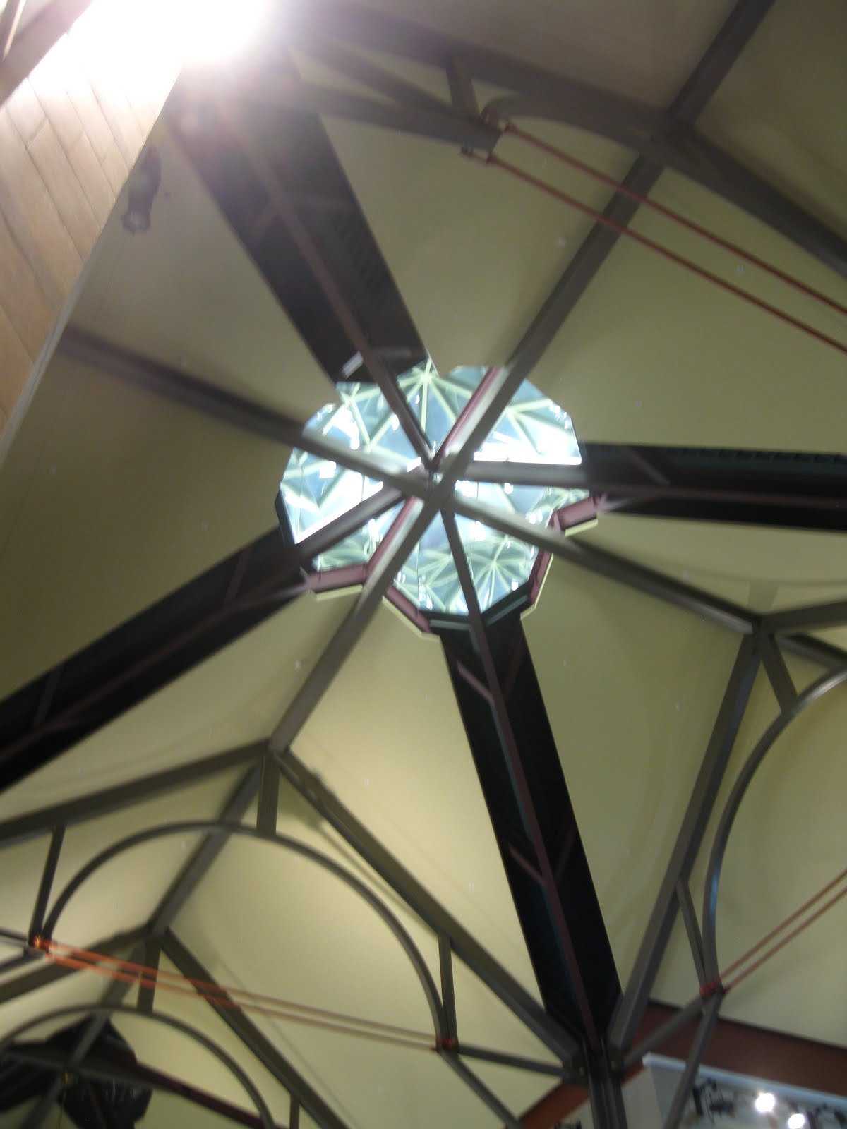
The low ceiling makes a modest effort to swoop upwards toward the slightly higher windows that look out on the tarmac, but the effect is on such a small scale that it hardly seems worth the effort. Also, portions of the ceiling are hung with netting in various colors, which lends a festive note but also clutters up any grandeur the place attempts to achieve.
At the end of the new concourse, a right turn puts you in space built a few years ago for U.S. Airways, which has a much bigger feel by comparison. The ceiling is also curved, unlike the United ceiling, which is straight. How come the new United space couldn't mesh with this, at least in terms of scale and shape? I'm all for variety, but this just seems mismatched and strange.

Back in United's new space, one thing that bothered me was that the gate areas seem awfully undersized. The seating itself is varied and interesting — some of it looks like vintage living room furniture. But there's clearly not enough. While I was there, a flight to Houston that was boarding, and the scrum spilled well out into the walk-through area, blocking anyone just trying to get by.
Still, it's nice to see United in one space at Logan. Now the puzzle is, of course: how to combine the U.S. Airways and American space now that they've merged?
Wednesday, April 10, 2013
ZIH: An aviation throwback

Zihuatenejo / Ixtapa International Airport has the feel of the dawn of the jet age: a one-story ground-level terminal (modest control tower attached); a handful of jets taxiing into position and lining up in a straight row; mobile stairways being wheeled into position; passengers marching across the tarmac amid the clatter of baggage trucks and the whine of jet engines.
I don't know where you'll find this scene in the United States anymore. But you will find it at the smart little one-strip airport that serves the twin Mexican resort towns of Zihuatenejo and Ixtapa. I passed through this facility going in and out of the area during the last part of March, 2013 while on a family vacation.

The airport, the region's tourism lifeline, is set just a few miles inland from the Pacific coast, which is lined with spectacular beaches, most undeveloped. Viewed from the air, the landing strip stands out like a black skidmark in an overwhelmingly brown agricultural landscape. (It was the dry season when we visited.)
Once on the ground, our American Airlines MD-80 taxiied to the sole apron, guided in by an ebullient ground crew. I've never seen people so happy to be flagging a jet into position! We then had to wait until a mobile stairway was wheeled into position, a rarity these days.
Thus we had the thrill of experiencing the blamming mid-day heat and blinding sunshine of southern Mexico all at once as we stepped out of the aircraft and into the open air. Somehow this seems more satisfying to me than disembarking through a hermetically sealed jetway, where you might get a hint of the real climate outside before you're delivered into the controlled atmosphere of a terminal.

Customs and passport control is handled off to one side of the terminal building, and seemed pretty straightforward, but with one game show-like element. After getting your passports stamped, you press a Family Feud-like buttom to randomly determine if customs officials will inspect your baggage. A green light means go ahead; a red light means open your bags and prepare to be questioned.
The layout of things outside the terminal is refreshingly simple: a road looping in front of the building, a parking lot, some coconut trees, and that's about it. Arrivals and departures are all handled at the same curb.

I'm not sure what the service patterns are at ZIH. American currently runs only trip per week to the airport, a Saturday-only run out and back from its DFW hub. THe place seemed dead on the Saturday we arrived, but a week later for our departure, the place was hopping, with flights departing mid-day for several domestic Mexican cities as well as international flights such as Frontier to Denver, United to Houston, Delta to Atlanta, and AeroMexico to Chicago and New York.
So it was busy, but never seemed overcrowded. Things are a little disorganized in the waiting area, with not all flights listed and gate assignments changing seemingly on a whim. But the big glass windows looking out on the tarmac really made it all worthwhile. As we boarded, a security guard asked me to put away my camera, so no photos from crossing the tarmac.
Taxiing out, I was again impressed by the upbeat manner of the ground crew. It seemed like a real party out there, with them waving goodbye to us. Wish that kind of enthusiasm could be imported elsewhere!
Friday, December 21, 2012
Surprise! Albany's impressive train station

It may not be located downtown, but Albany, N.Y. has one impressive train station.
Climbing up from the platforms, arriving passengers enter a grand hall that feels unexpectedly monumental. It's way better, for example, than what Amtrak is stuck with at Penn Station in New York City.

All this for Albany?
Well, yes. Albany claims to be the ninth-busiest station in the whole Amtrak system (a statistic I found on ever-reliable Wikipedia), something that seems rather surprising at first glance.
But then again, it makes sense when you consider that Albany boasts a level of passenger rail service that most small cities in the United States haven't seen since World War II.
Not only does the Capital Region enjoy frequent service to Penn Station (14 round-trips each weekday, according to the current Amtrak timetable), but it also maintains frequent service to Buffalo (three trains daily each way), as well as nightly service west to Cleveland and Chicago (sleeper on the Lake Shore Limited, anyone?), east to Boston, and north to the thriving metropolis of Rutland, Vt.
Add in two exotic international trains that cross the Canadian border – the Maple Leaf to/from Toronto and the Adirondack to/from Montreal, which both pass through here each day – and you've got yourself a schedule that most cities of similar size would envy.
So it adds up to one busy place – about 700,000 rail passengers a year, again according to Wikipedia. And things will only get busier due to a recent agreement with freight carrier CSX for Amtrak to take control of the tracks from here south to Poughkeepsie, a big chunk of the route to New York City.
This will improve dispatching and also clear the way for track improvements to speed up travel time to/from the Big Apple, so more service is planned for the future – so much so that a fourth platform is planned in additional to the existing three.
Just as the level of passenger service evokes a bygone era (a nightly sleeper to Chicago?), so does the passenger terminal. It's big – not quite cathedral scale, but big enough to give the Capital Region a rail gateway that the community can be proud of.
The main hall, ringed by balconies and sporting an impressively tall windows, has a genuinely grand feeling. The peaked roof soaring above evokes a feeling of being in some great Gothic hunting lodge or library. The tall windows looked impressive and inspiring even in the darkness.

The colors work together like players in a string quartet: elegant pink granite, rich brown wood, green-painted steel structural and ornamental elements, cream-colored walls, all of it anchored and reflected and amplified by very attractive designs in the floor tiling.
And it's a busy enough place to support a nice range of retailers, including a full sit-down restaurant, a big bookstore/newsstand, and other shops. It was enough to be useful, anyway, to those of us on the Lake Shore Limited (Boston to Chicago, with a two-hour layover in Albany) who wanted to escape the train for awhile and wander around.
All this in a station that, praise be, was actually designed and built in the modern era, opening in 2002.
I'd been through it before, but never had a chance to explore the station since it opened. (In earlier days, my primary memories of Albany are of the downtown bus station, which I used to visit a girlfriend. Later, while in college in the 1980s, I would take Amtrak from NYC up to visit a high school friend at Rennsalaer Polytechnic Institute, but I recall the station being little more than a platform in the middle of nowhere.
Of course prior to all this, Albany was home to Albany Union Station, an enormous Beaux Arts station from the late 19th century right in center of downtown. Here it is:

With rail service in decline, then-tenant Penn Central moved out in December 1968, and the majestic building fell into serious disrepair. Fortunately, a bank renovated it in the 1980s, and it's back in business today, though not as a rail station.
Which takes us back to the present station, about a mile-and-a-half away and across the Hudson from downtown Albany. Although it was dark, I ventured out front to see if the station's exterior lived up to the inside. I wasn't disappointed. The place has the same feel – a structure of consequence that gives the feeling that something important happens here.

And perched high above the main entrance was, yes, a giant clock (non-digital) with four sides that must have been visible from some distance. The faces were lit, too and each seemed to be displaying the correct time, too.
Yes, I suppose overall the place does have a kind of modern synthesized Disney World feel to it. The clock tower in particular looks like something out of sci-fi movie – or maybe a giant pencil eraser. In terms of a local reference point, it might be a kind of stripped-down version of the Governor's Mansion:
Is this...

...an homage to this?

Perhaps this feeling is a function of the place just being so – well, new. After all, we don't see many brand spanking new train stations in this country anymore.

In fact, the only other one I can think of is the big new Lautenberg transfer station in Secaucus, N.J, which rises out of the marshes and does its best to channel the ghost of the original Penn Station, the next stop on the line. The Lautenberg station, too, feels kind of theme-park-ish, perhaps just by virtue of its newness. But hey – it took Grand Central Station a century to become the Grand Central Station we know today.
One element that adds to the station's role as a transport hub is a surprisingly robust bus service. I remember my RPI friend joking about the local bus system's inane radio commercials, but there seems to be a heckuva lot more options than in my hometown of Manchester, N.H. Check out the rack of timetables!

Maybe it helps to be the capital city of the “Empire” state, with all the prestige (and money) that comes with it. Maybe it's no coincidence that the Albany area also boasts a first-rate airport with a wonderful contemporary terminal, as well. (I passed through there in March, 2012.)
Minor quibbles: the bridge above the platforms forms a kind of airline gate waiting area, complete with TV set droning on. Lose it!

But no matter. Albany's train station is a delightful surprise, especially in the context of the revenue-starved state of passenger rail service in the United States. In some places, the detail is extraordinary, such as this frosted and gridded ceiling on the stairways down to the platform.

I would love to see it during the day, with sunlight flooding not only the stairwells, but streaming through the giant windows and down from the glass cupola set way up in the ceiling, like some kind of oversized lighthouse.

So take a lesson from Albany, other cities. A passenger rail station erected in our lifetime does NOT have to have the inspiration and ambiance of a Quonset hut. No indeed – it can be an inviting beacon of light and space, which is certainly was when I passed through.

Saturday, September 1, 2012
Good article about airline terminals
It's understandable that the mainstream media doesn't run a lot of stuff about airport terminal design. Why worry about that when we're all wondering who will finally be Kelly's permanent replacement for Regis Philbin?
But once in awhile, you get something surprisingly thorough. In this case, it's a good piece with national scope by Curtis Tate, a reporter for the McClatchy Newspaper group that I found on the Web site of the Tacoma (Wash.) News-Tribune.
U.S. Airport Terminals Upgrade to First Class
One thing I didn't realize was that Kansas City is planning to somehow integrate its three curving terminals into one facility. Good luck with that! But a quick search found a good Kansas City star piece from 2011 about the whole issue:
Like It Or Not, KCI Needs To Change
While they're at it, they should do something about the MCI / KCI confusion that plagues this airport. The FAA code is MCI, for 'Mid-Continent International.' But everywhere else, it's KCI, for obvious reasons: highway signs, map, the airport itself. It's not a life-or-death issue, but it offends the anal-retentive geek in me.
The article speaks of building a completely new terminal "to the south" while the existing complex continues to operate. I had a hard time visualizing this, but then I found this diagram from the KCI (not MCI?) Master Plan.
 I think the layout of the terminal and gate piers is just sketched in to put something in there, as they're still years away from hiring an architect. Anyway, must be nice to have so much open land around to use! (Compare that to the cramped conditions of so many other airports, hemmed in by development.)
Also in Kansas (getting back to the McClatchy article), it's great to hear in the McClatchy piece that Wichita is going forward with a new terminal. I visited the current terminal this spring and it had all the presence and character of a junior high cafeteria.
On another note: Things have been a bit slow on this blog over the summer, but that's about to change, with visits to Dallas, Denver, and other airports in the offing. Plus I'll fill in the gaps with some visits to airports in my own corner of the world, New England, including Portland, Maine; Providence, R.I.; Hartford, Conn.; and Burlington, Vt.
Fasten your seat belts!
Thursday, June 7, 2012
Now playing at LAX: the "Walk of Shame"
Here's an excerpt from a piece by writer Ted Reed about an ugly airline terminal that I just noticed that was posted today on thestreet.com.
Ugly Airports: LAX's 1,000-Foot Walk of Shame
Ted Reed
06/07/12 - 06:11 AM EDT
LOS ANGELES (TheStreet) -- At Los Angeles International Airport, the world's sixth busiest airport and the third busiest international gateway in the United States, you would expect terminals and passageways that are stately yet functional.
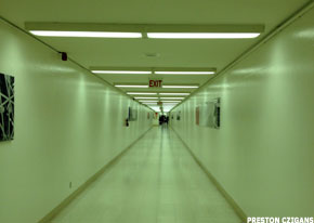
Instead, if you are walking between terminals five and six, you get a long, narrow corridor bathed in fluorescent light, without windows or clear signage, filled with echoes of conversations and seemingly leading from one dead end to another. The corridor provides first-time users with the sense of being in the wrong place with no option but to continue, as the threat of a missed connection hovers.
In short, you feel lost in a horror movie or, at best, trapped into undergoing a clinical test for elevated stress levels.
Recently Preston Czigans, an Atlanta-area guitarist on his way to a session to record background tracks for commercials, was changing planes when he came upon this seeming passageway to hell. Czigans was flying on Delta (DAL) from Atlanta to San Francisco via Los Angeles.
"I got off the plane at LAX and followed signs," Czigans recalled. "I went down an escalator. It dead-ended at a wall, and you could only turn left into this long, empty hallway. I thought 'I'm not supposed to be here, I'm in the wrong place," but I noticed a few stragglers making the trip down the hallway so I took off walking.
"It was probably about 1,000 feet, a sterile environment with a white floor and white walls with a few pictures that made it look like somebody had started to decorate it, then forgot about it. There was no signage.
"When I got to the end, it was another dead end, with an escalator to go up one story to the terminal," Czigans said. "Sadly, this is a passageway used by countless thousands of travelers every day."
To read more about this situation, and get an explanation of how it came to be, check out the complete post. And while you're at it, check out The Street's coverage of ugly airports and beautiful airports, too.
Wednesday, April 4, 2012
SFO Terminal 3: Opportunity Lost

A brief trip to San Francisco led to an encounter with Terminal 3, a relatively new facility that houses the West Coast hub of United Airlines. It's certainly nice enough. But as a major transcontinental hub for what is currently the world's largest airline, it's a major let-down.
First the good news. It's new and clean, and reasonably uncluttered by retail distractions. You don't feel like you're in a shopping mall. You don't feel like you're being subjected to a retail environment designed to suck every last dollar out of your wallet. You know you're in an airport. You can see the aircraft and the field beyond, such as here, in a long connecting corridor:

And in a nice touch, a gate concourse atrium has replicas of vintage aircraft hanging in a few places.

And yes, it seems to move passengers in and out efficiently, though not by means of any exciting innovations. It's all been done before, same as anywhere else.
But coming in and then heading out, the place seemed a little antiseptic. It's a little too white, a little too cool. A little too blandly corporate, as if it were built on spec in the hopes that somebody in search of Class A airline terminal space would move in, which surprised me. Get a load of this scene:

Why is this a lost opportunity? Because United, the sole occupant of Terminal 3, is a long-term tenant at SFO, one of the carrier's longtime strongholds. This airport has been the airline's original transcontinental base going back to the dawn of commercial aviation. It's also where United first flung Boeing 377 Stratocruisers out into the Pacific after World War II to conquer Hawaii and turn it into the major tourist destination it is today.

Later still, when United acquired Pan Am's Pacific routes in 1985, no station on the network felt the impact more than SFO. Its importance broadened into a global hub connecting far-flung Pacific rim destinations from Seoul and Sydney to Bangkok and Beijing.
Is any of this reflected in the terminal that greeted me when I stepped off my 757 from Boston? No? Instead, I got an off-the-shelf gate area that fronted a corridor with a raised ceiling, yes. But it could have been anywhere. The color was white and the contours included chunky rounded angles. It's like they made a deal to subliminally promote Marshmallow Fluff.

In most of the terminal, the only thing setting off the white white white was floor coverings that were drab drab drab, featuring a pattern designed to evoke -- I don't know, muddy pasta?

It seemed especially in-your-face in low-ceiling passages such as the one above. Yes, nothing evokes the aspirational aspect of flight than a tunnel with a depressing carpet pattern. Did United authorize this to make their cabin interiors seem clean by comparison?
Seriously, I was at a loss. Instead of saying anything about what kind of airline United was, the place was as blankly corporate as the way United's uninspired post-merger "compromise" livery: the Continental tail and blue/gold colors, UNITED in a blah all-caps font on the plane, and we're done. Out went the tulip and the remnants of three paint schemes still on some of the United fleet. We're lucky they kept Gershwin's 'Rhapsody in Blue' on the payroll.
Look at this below. Airport, or bank lobby, or shopping mall? Or blank dull nothing?

If this scene were a person, it would be a robot. With plants.
As a major hub for the combined carrier, you think there'd be a little hometown pride evident in a new and modern terminal. Instead, we get a few plants and, incredibly, an exhibit about vintage sewing machines. Sewing machines?

About the plants: Weirdly, at one place they come in huge sizes that seem out of proportion with human beings. This is just scary, like a scene out of 'Little Shop of Horrors.' Someone tell those people not to get too close!

Contrast this with what United enjoys at Chicago O'Hare: the jazzy Terminal One complex, designed by Helmut Jahn in the late 1980s to accommodate Chicago's role as the airline's major transfer hub in the post-dereg era. Even 25 years of creeping commercial crud can't diminish the excitement that this place lends the flying experience, even if you're just changing planes.
In United's San Francisco hub, you get all the excitement of a conference room in the company where Dilbert works. There's art here and there, but it seems to be the result of someone's checklist rather than any coherent plan to celebrate journeying or the magic of flight.

Even when they try, as in this stairway corridor in the check-in area, the effect is rather cold and heavy and plastic, as if the decorative scheme was based on the uniforms of Darth Vader's Imperial Storm Troopers.

Maybe I'm missing something, but as I walked from the gate to the baggage area and then to hotel shuttle van curb, Terminal 3 said nothing to me about where I was or the airline I just flew and its long and storied presence here. Instead of feeling like I was part of a long tradition of a great city welcoming travellers from all over the world, I felt like I was attending a newspaper advertising sales conference at the Holidome in Topeka, Kansas. What a lost opportunity.
Out on the curb, I finally noticed something that indicated a little pride of place. It was a banner celebrating the return of the A380, the world's largest passenger aircraft, to regular service at SFO.

The airline? Lufthansa, which doesn't even use this terminal.
P.S. I got a chance to peak briefly at the adjacent international terminal, another gleaming new facility. This is what we're putting up against the massive showplaces in Beijing, Hong Kong, Bangkok, and elsewhere. It's another future-is-now disappointment, filled with spaces such as these:


It may be new, but it's all a small-minded pale shadow of the Asian airports with which it competes.
Subscribe to:
Posts (Atom)