Showing posts with label United Airlines. Show all posts

Tuesday, May 13, 2014

United's new Terminal B space
at BOS: Some first impressions

An artist's rendering of the newly completed Terminal B concourse for United Airlines at Boston's Logan International Airport.

You don't get a second chance to make a first impression. That's what I was thinking on Friday, May 9 when I arrived at the just-opened Terminal B space, new home of United Airlines at Boston's Logan Airport.

By "just opened," I mean 10 days earlier. Wow! I had no idea this transition was taking place when I booked my flight to San Francisco last month, and only learned of it through mainstream news reports. So I was eager to check it out.


A view of the new concourse, with its vertical windows (good) and slightly tipped-up ceiling (not so good.)

Prior to the United-Continental merger in 2010, United was a long-time occupant of Terminal C going all the way back to pre-dereg days. As a kid in the 1970s, I would go up to the old control tower's observation deck (long-since closed), and a highlight was watching United's morning non-stop to San Francisco, usually a 747, pull back from C gate right in front of us.

At Logan, Continental and predecessors such as People Express didn't have nearly that kind of pedigree. The carrier bounced around over the years, finally landing at Terminal A prior to the merger. So once the two carriers joined up, they had to somehow be brought under one roof at Logan.

The answer? A new pier on the eastern corner of Terminal B.

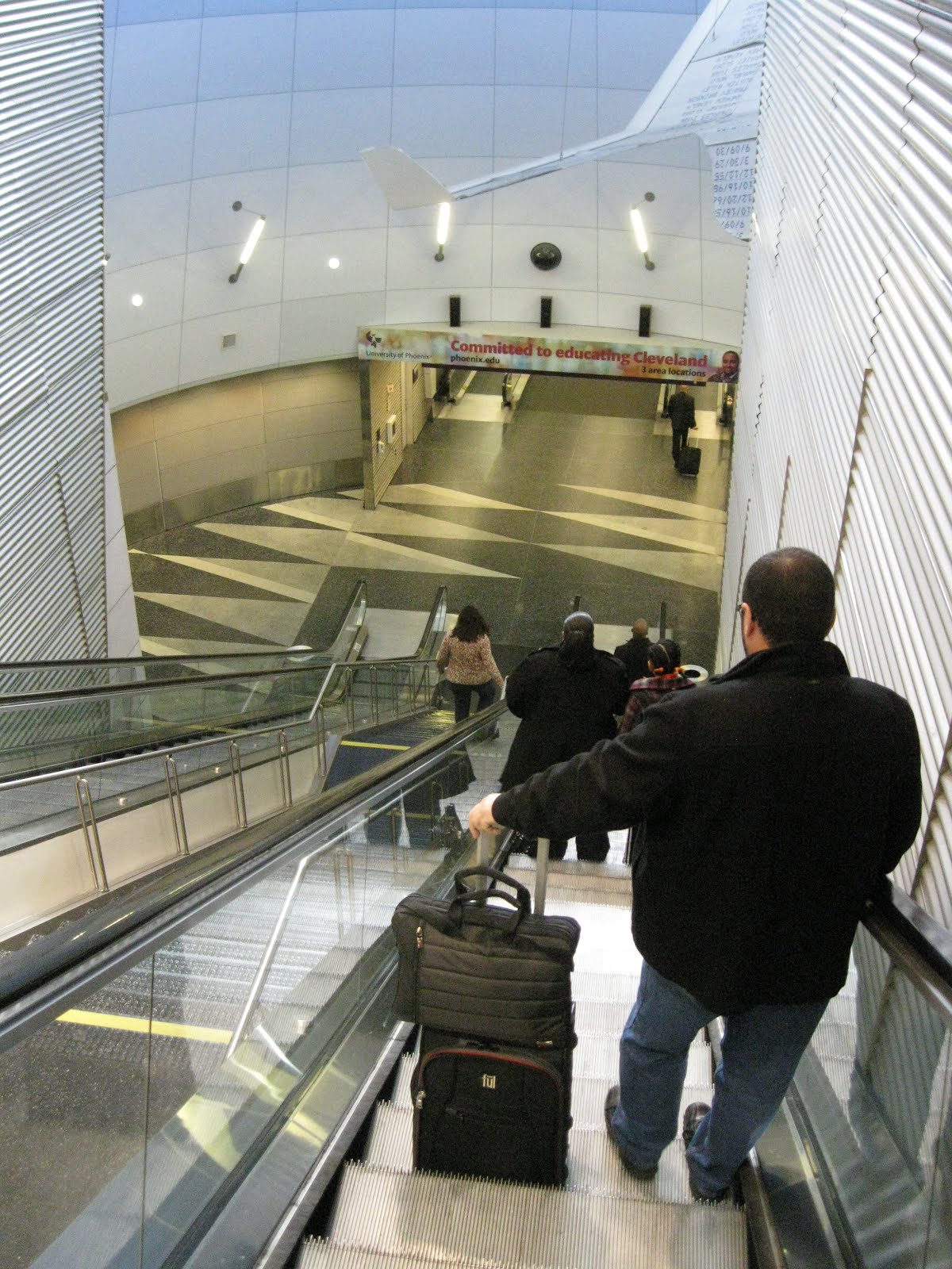
In the works for a couple of years, it not only provided 10 new gates for United, but also connected the American gates on side of the terminal with U.S. Airways gates way on the other side. (See the former pre-United layout at left. The new concourse links Gate B-21 with the area around B-27.) The effect was to create one big continuous post-security concourse that surrounds the terminal on three sides. Not a bad retrofit!

United kitted up the new space with the latest "do-it-yourself" gadgetry such as self-ticketing kiosks, which allow you to check bags unassisted. The gates have self-scanning units with glass doors that part when you're cleared to board, just like a subway turnstyle. One release from United boasted that you can go from curb to plane seat without dealing with a human being.

The brave new world of customer service: eight self-service kiosks and one employee.

Well, not quite. You still have to deal with the TSA, and that was the big disappointment the morning I came through. I already had my boarding pass and wasn't checking any bags, so didn't need to use United's nifty new ticket area. But I did need to join a stress-inducing long line (will I make my flight?) at the woefully inadequate TSA checkpoint.

It wasn't clear where you should go, what line you should stand in, or how long any line was. And, to make matters worse, a TSA agent was letting random groups of people move out of sequence to even up the various entry points to security. To someone trying to make an early morning flight, there is nothing worse that this kind of chaos.

I know this has nothing to do with United, or the other airline tenants in the terminal. But it's a huge, huge black eye that colored my whole experience of Terminal B. It can be spectacular in all respects, but all the effort put into the new space by United and Massport (which owns and runs Logan) is completely wiped out by bad TSA processing.

It doesn't have to be this way. The new security point in Terminal C, opened just a few years ago, is far easier to navigate. So in terms of the value of first impressions, United should work with Massport and the TSA on the way security is handled if this new $30 million space is going to bring added value to their Logan operation.

United's new "do-it-yourself" gate kiosks, which passengers operate on their own, like a subway turnstyle.

Once beyond security, I barely had time to notice any of the features, as my flight to SFO was already boarding. (Yes, I did use the new "people-less" boarding process, but a United gate agent had to coach me on how to do it.) Incredibly, the 757-200 had plenty of empty seats! This is so rare nowadays that it deserves a mention. I had selected my seat near the back when I booked, and found I was surrounded by empty seats! I could actually stretch out across three, and slept for a good portion of the flight, something I haven't done in years.

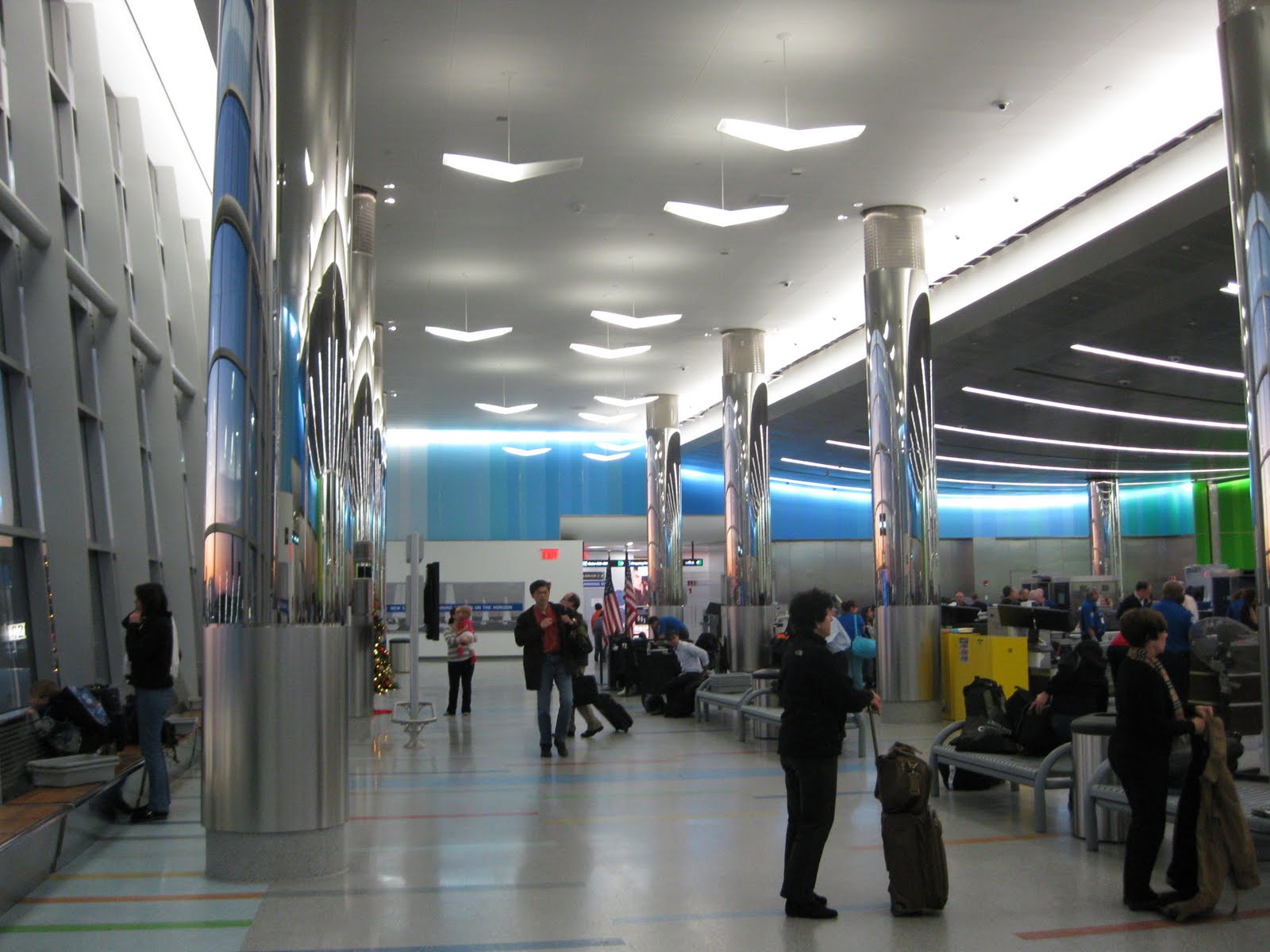
I returned on Sunday, when I had more of a chance to look around. I found the new United concourse to be pleasant enough, but nothing spectacular. There's very little that's distinctive: even the carpeting is the same as in United's San Francisco terminal! A lost opportunity.

At least the windows are vertically oriented instead of horizontal, avoiding the caged-in "prison bar" effect that prevails at so many other new terminals. Score one for common sense!

The low ceiling makes a modest effort to swoop upwards toward the slightly higher windows that look out on the tarmac, but the effect is on such a small scale that it hardly seems worth the effort. Also, portions of the ceiling are hung with netting in various colors, which lends a festive note but also clutters up any grandeur the place attempts to achieve.

At the end of the new concourse, a right turn puts you in space built a few years ago for U.S. Airways, which has a much bigger feel by comparison. The ceiling is also curved, unlike the United ceiling, which is straight. How come the new United space couldn't mesh with this, at least in terms of scale and shape? I'm all for variety, but this just seems mismatched and strange.

Houston, we have a problem: Undersized gate areas cause the concourse to be blocked when a flight boards, such as this flight to Houston.

Back in United's new space, one thing that bothered me was that the gate areas seem awfully undersized. The seating itself is varied and interesting — some of it looks like vintage living room furniture. But there's clearly not enough. While I was there, a flight to Houston that was boarding, and the scrum spilled well out into the walk-through area, blocking anyone just trying to get by.

Still, it's nice to see United in one space at Logan. Now the puzzle is, of course: how to combine the U.S. Airways and American space now that they've merged?

Wednesday, April 4, 2012

SFO Terminal 3: Opportunity Lost


A brief trip to San Francisco led to an encounter with Terminal 3, a relatively new facility that houses the West Coast hub of United Airlines. It's certainly nice enough. But as a major transcontinental hub for what is currently the world's largest airline, it's a major let-down.

First the good news. It's new and clean, and reasonably uncluttered by retail distractions. You don't feel like you're in a shopping mall. You don't feel like you're being subjected to a retail environment designed to suck every last dollar out of your wallet. You know you're in an airport. You can see the aircraft and the field beyond, such as here, in a long connecting corridor:


And in a nice touch, a gate concourse atrium has replicas of vintage aircraft hanging in a few places.


And yes, it seems to move passengers in and out efficiently, though not by means of any exciting innovations. It's all been done before, same as anywhere else.

But coming in and then heading out, the place seemed a little antiseptic. It's a little too white, a little too cool. A little too blandly corporate, as if it were built on spec in the hopes that somebody in search of Class A airline terminal space would move in, which surprised me. Get a load of this scene:


Why is this a lost opportunity? Because United, the sole occupant of Terminal 3, is a long-term tenant at SFO, one of the carrier's longtime strongholds. This airport has been the airline's original transcontinental base going back to the dawn of commercial aviation. It's also where United first flung Boeing 377 Stratocruisers out into the Pacific after World War II to conquer Hawaii and turn it into the major tourist destination it is today.


Later still, when United acquired Pan Am's Pacific routes in 1985, no station on the network felt the impact more than SFO. Its importance broadened into a global hub connecting far-flung Pacific rim destinations from Seoul and Sydney to Bangkok and Beijing.

Is any of this reflected in the terminal that greeted me when I stepped off my 757 from Boston? No? Instead, I got an off-the-shelf gate area that fronted a corridor with a raised ceiling, yes. But it could have been anywhere. The color was white and the contours included chunky rounded angles. It's like they made a deal to subliminally promote Marshmallow Fluff.


In most of the terminal, the only thing setting off the white white white was floor coverings that were drab drab drab, featuring a pattern designed to evoke -- I don't know, muddy pasta?


It seemed especially in-your-face in low-ceiling passages such as the one above. Yes, nothing evokes the aspirational aspect of flight than a tunnel with a depressing carpet pattern. Did United authorize this to make their cabin interiors seem clean by comparison?

Seriously, I was at a loss. Instead of saying anything about what kind of airline United was, the place was as blankly corporate as the way United's uninspired post-merger "compromise" livery: the Continental tail and blue/gold colors, UNITED in a blah all-caps font on the plane, and we're done. Out went the tulip and the remnants of three paint schemes still on some of the United fleet. We're lucky they kept Gershwin's 'Rhapsody in Blue' on the payroll.

Look at this below. Airport, or bank lobby, or shopping mall? Or blank dull nothing?


If this scene were a person, it would be a robot. With plants.

As a major hub for the combined carrier, you think there'd be a little hometown pride evident in a new and modern terminal. Instead, we get a few plants and, incredibly, an exhibit about vintage sewing machines. Sewing machines?


About the plants: Weirdly, at one place they come in huge sizes that seem out of proportion with human beings. This is just scary, like a scene out of 'Little Shop of Horrors.' Someone tell those people not to get too close!


Contrast this with what United enjoys at Chicago O'Hare: the jazzy Terminal One complex, designed by Helmut Jahn in the late 1980s to accommodate Chicago's role as the airline's major transfer hub in the post-dereg era. Even 25 years of creeping commercial crud can't diminish the excitement that this place lends the flying experience, even if you're just changing planes.

In United's San Francisco hub, you get all the excitement of a conference room in the company where Dilbert works. There's art here and there, but it seems to be the result of someone's checklist rather than any coherent plan to celebrate journeying or the magic of flight.


Even when they try, as in this stairway corridor in the check-in area, the effect is rather cold and heavy and plastic, as if the decorative scheme was based on the uniforms of Darth Vader's Imperial Storm Troopers.


Maybe I'm missing something, but as I walked from the gate to the baggage area and then to hotel shuttle van curb, Terminal 3 said nothing to me about where I was or the airline I just flew and its long and storied presence here. Instead of feeling like I was part of a long tradition of a great city welcoming travellers from all over the world, I felt like I was attending a newspaper advertising sales conference at the Holidome in Topeka, Kansas. What a lost opportunity.

Out on the curb, I finally noticed something that indicated a little pride of place. It was a banner celebrating the return of the A380, the world's largest passenger aircraft, to regular service at SFO.


The airline? Lufthansa, which doesn't even use this terminal.

P.S. I got a chance to peak briefly at the adjacent international terminal, another gleaming new facility. This is what we're putting up against the massive showplaces in Beijing, Hong Kong, Bangkok, and elsewhere. It's another future-is-now disappointment, filled with spaces such as these:


It may be new, but it's all a small-minded pale shadow of the Asian airports with which it competes.

Friday, March 2, 2012

Cleveland (CLE): Still a hub, barely


Hopkins International Airport in Cleveland will have to wait another day for a full exploration, as I just changed planes there (on Monday, Feb. 27, 2012) with little time to spare, and my camera's batteries ran out in the process. But a few thoughts.

The airport, formerly the smallest hub in Continental's network, is now a really small hub within the gigantic United/Continental network. With no international flights (except to Canada and Mexico), and with powerhouse globally connected hubs all around it (Newark, Dulles, O'Hare), it's only a matter of time before Cleveland goes the way of Pittsburgh, I think – no connecting banks of flights, just each carrier with a handful of routes to other hubs.

Spring 2014: Just to update, United has indeed pulled the plug on the Cleveland hub. As of June, the D Concourse will be mothballed, and most of the C gates abandoned as well. I last flew through this hub in February/March 2014, and I'll miss it. So much for not having to connect in Newark.

The place already has that kind of feel to it. Changing planes took me from the C to the D Concourse, and virtually every plane in sight was a regional jet—mostly extra-small Embraer 145 twin jets, or turboprops. I think I saw two “mainline” 737s of United/Continental in the whole airport, fewer than what Southwest had parked at its gates! The passenger counts for United must be abysmal.

And that's odd, because Cleveland was once a major city for the old pre-deregulation United. In the early 1970s, the airline flew DC-10s non-stop to Los Angeles and San Francisco. But United abandoned Cleveland in 1985 in favor of building up a hub at Dulles in Washington D.C., which prompted Continental Airlines (then under Frank Lorenzo) to move in.

Now, all these years later, United and Continental have merged, and Cleveland is back as a United hub—the smallest in the network, not counting Guam. And yes, United once again flies non-stop to the west coast, but now with 737s: two each day to LAX, one to SFO. Other than that, it's mostly regional jets: about 80 percent of UAL's flights out of Hopkins. Some hub! From the look of things when I passed through (the mid-morning lull), you'd be lucky to get a full-sized jet on any leg out of Cleveland.


The C concourse, where we pulled in, seems tired and uninspired, as unwilling to face the week as the few people stumbling through it were. Upon exiting the jet bridge, I found myself in a circular pod with low ceilings, beat-up carpeting, and weird signage that directed me clockwise (the long way around) the pod to get to the D concourse tunnel. With virtually no other gates occupied, the place was deserted except for a trio of security officers, who of course immediately swarmed me when I pulled out my camera.


“Did you get a photo the guitars?” one asked in that slightly-too-helpful tone used when they're checking for nutjobs. She was referring to a display promoting Cleveland's Rock 'n' Roll Hall of Fame. Could have been a tie-in with the canned music I was hearing in the quiet C concourse, but no—that was some kind of hangdog country music tune. In our brief chat, the officer at least provided a helpful suggestion: that I should come back and take photos of the “new terrazzo floor” due to go in.

And about time, I thought. Cleveland is burdened with a lot of carpet in high traffic areas, and much of it looks ready for a trip to the dump: dirty, stained, and in some places sporting waves of wrinkles.


Out in the C Concourse's long corridor, the white linoleum floor was in the process of being pulled up, revealing the original flooring, which looked a lot classier, I thought. Must have been nice to get on one of those DC-10s to LAX back in the day.

I then took the long escalator down to the underground tunnel leading to the D concourse, of much more recent vintage and added when Continental was building its Cleveland hub in the 1990s.


The tunnel is nothing special (especially when compared to United's spectacular walkway in O'Hare's Terminal One), but does sport some “Time Flies” metal artwork in a space otherwise dominated by paid advertising. Unfortunately, the grey metal artwork is barely visible to passengers moving through the mostly grey tunnel. (Here's where the camera's batteries gave out, but I eventually managed to find my spares.)

Strangely, the tunnel is anchored at both ends by odd bulging lighthouse-like structures that remind me of the portals used in older 19th century tunnels, such as Isambard K. Brunel's celebrated pedestrian walkway under the Thames.

Not sure what the reasoning is in Cleveland, but the shafts, topped only by a narrow band of windows around the top, are visually jarring and perhaps a little frightening. What were they thinking?


The good news in Cleveland is that the D concourse shows at least a little imagination and concern for design. Where the C concourse (and the others at Cleveland, from what I can tell) are mostly window-less corridors that do nothing to link travellers to the tarmac and the aircraft on it, the D concourse sports wide open windows with generous views all around. Also, they're tilted forward a bit, which, coupled with an angled ceiling line, creates some nice energy. It's not a big place (just a handful of gates), but it's certainly sporty.


The gate areas play off the overall shape, with doorways tilting in the opposite direction of the windows, providing a satisfying balance.


And between gates, there's room for interesting amenities such as a massage service and three-seat shoeshine stand, unmanned when I passed by.


Here and there, you'll find details that mimic the overall design.


Alas, there's carpeting, and in some places it looks just as tired what's in the C concourse across the tarmac. Replace it or use something different! And one big complaint about the D concourse is that stores and amenities are concentrated in the middle of the structure, blocking views and light from the other side. Maybe there's no easy way around this.


Worse, one restaurant I went in had the windows totally blocked at eye level by over-sized booth seating, as if to say that no one in their right mind would want to be reminded he or she is at an airport. Pity!

I was surprised to see birds flying through the D concourse, but something tells me they're not supposed to be there. Maybe they're looking for all the earthworms. (See "interesting fact" below.) And below is an example of that pesky airline terminal bugaboo, the "window without a view." Why bother?


Interesting fact about Hopkins, courtesy Wikipedia: In September 1972, hundreds of thousands of earthworms crawled onto the airport's longest runway. Four pilots complained that the worms caused poor braking. Heavy rains apparently brought the worms to the surface, creating enough of a safety hazard for the strip to be closed for a half-hour for earthworm removal. Workmen used a motorized broom to sweep the squirming mass away.

Saturday, December 3, 2011

Boston Logan's Terminal C: A successful reboot!


What was new got old, but is now new again. That's the story of Terminal C, the oldest passenger facility in continuous operation at Boston's Logan Airport. Opened as the "North Terminal" in 1967 early in the jet age, the place recently got a $55 million makeover to accommodate the realities of post-9/11 security and also the needs of JetBlue, which, as Logan's busiest carrier, has pretty much taken over the space in recent years.

The changes, in the works for awhile now, were completed this past July. A recent flight from Logan to National Airport in Washington, D.C. was my first chance to check it all out. What I found was a sparkling renovation that brilliantly augmented the terminal's original design with a smart basic plan and some marvelous details. Read on.

In its original 1960s configuration, Terminal C was Dulles lite, featuring a smartly swooping concave roof and sweeping view of the tarmac beyond. Enough glass was on hand to counteract the trendy (and dingy) concrete brutalism, and its big main space was impressive. Envisioned before the energy crisis of the 1970s dulled the appetite for grand public spaces, it bespoke optimism, and wore the years well. Here's what the main concourse looked like in 2004:


In recent years, Logan's other facilities were modernized one by one, and Terminal C began to show its age. In a bad move, more ticketing space was created by lining the airside wall with check-in counters, blocking the tarmac view. In 2005, Delta moved to Terminal A; since then, Terminal C has come to be dominated by JetBlue, now the busiest carrier at Logan and set to take over all of Terminal C when United moves to Terminal B in 2013.

Over the years, practical problems surfaced. For one thing, the two narrow gate piers lacked room for modern security screening — an especially sensitive issue as Terminal C was the departure point for one of the 9/11 flights that hit the World Trade Center. The solution? Create a single modern security checkpoint behind the existing main terminal, from which passengers could access either concourse. As part of the project, Terminal C's old look would be updated from concrete brutalism into something into something zippier and more upbeat.

Fearing the worst, I figured this retrofit would mess up or completely obliterate Terminal C's simplicity and majesty. They'd stick a big prison-like box behind the ticket counters, all concrete and fluorescent lights, because security is not to be taken lightly. And we'd take yet another step away from the magic of flight and toward a characterless, colorless future where air and bus travel are seemingly no different.

So imagine my surprise to find the Terminal C redo a jaunty, colorful triumph! Really! The good things about the place are still all there—the swooping roof, the big main space, the omnipresent murmur—but the new part harmonizes wonderfully with the old, and the entire facility has been transformed into a light, bright and inviting space that can't help but infuse any journey (even the slog through security) with a sense of fun and wonder.

Walking in from Central Parking, your first glimpse of Terminal C comes when you enter an overlook way up near the main hall's sloping ceiling. From this perch, you quickly get a sense of what's to come. Below you, where once there was mostly concrete (I recall the ceiling was done in a cement-gray spackle), now there's light and color. Racing strips of white lights set into the curved ceiling create a jazzy neon-like effect, and the former bare concrete support pillars are now sheathed in curving panels of a translucent ice-blue material lit from within.


It's lighter, brighter, and more buoyant than I could have imagined. Hey, there's life in the old girl yet!


One thing they didn't redo is the main terminal's floor, which still bears all the evidence of more than four decades of heavy use. And good! I think it lends the place character...


But the real surprise was the new consolidated security area grafted onto the airside portion of the original terminal. Rather than just attach a utilitarian box, the designers created a space that harmonizes with the old terminal, jazzes it up, and delightfully restores the panoramic view of the busy tarmac beyond.

It succeeds in several ways. Most impressively, the new area is tied to the old main terminal by the use of two additional swooping roofs! These are lower and are clearly secondary to the main building, but they way they overlap knits the old with the new in seamless fashion.

Another success is how the place uses color and light. First, those neon-like stripes of white bulbs now embedded in the main terminal's swooping ceiling are carried through on the two smaller swooping ceilings that were added. Then, the side walls sport stripes of pastel hues that gradually shift from intense orange through warm yellows and spring greens to sky blue. These function as vibrant accent colors, and their progression follows a passenger's trip through the building, lending a sense of motion and forward progress to the experience, even when you're standing in a slow line. The fact that you can see the tarmac beyond also gives you a sense of getting somewhere. Here's a shot looking back through security that shows how the colors work:


How cool is it that by the time we clear security, we've arrived in an area defined by the color of a clear blue sky?

But there's more. In a masterstroke, numerous narrow support columns were sheathed in a shiny mirrored surface. What's the big deal? Well, each column reflects the rows of white lights in crazy parabolas that change constantly as you move through the space. Also, the columns pick up accent colors from the walls, adding greens and yellows and blues to the mix. The columns also reflect the windows that look out on the tarmac. Here's a sample of the results:


It's really upbeat and exciting and lends a tremendous energy to the space, but in a way that doesn't hit you over the head. I'm not sure how much of this was specifically planned and how much was an accident, but it all came together beautifully!

And numerous details help the place strut. TSA officials work not from improvised lecterns, but from stylish hardwood-sheathed podiums that harmonize with the surroundings. The floor is done in an understated mix of colors that mirror those on the wall, and in asymmetric patterns that add to the buoyancy. Above, even the light fixtures evoke the shape of birds in flight.


Finally, let's not forget the big window that looks out on the tarmac. Looming dramatically beyond the security area, it functions as a destination and pulls you through. And they actually went to the trouble to tilt it forward at an angle, in deference to the original terminal's design. That's a lot of effort that you can't expect in this day and age, but in the Terminal C revamp, they got it right:


P.S.: Alas, not everything was buffed up. Peek in the baggage claim area on the lower level and you'll find it's still the 1970s down there. It's the same low-ceilinged area it always was, making for a dull place, with one exception.


The lower level sports one innovation that I've seen nowhere else. United Airlines has installed a gallery of lost bags displayed in glass cases that resemble oversized aquariums. What a helpful way for an airline to lift the curtain and neutralize suspicion about missing or misplaced luggage. It says, "Here's what we've got, folks!" and that there's nothing to be hidden. Even if your bag isn't there, it's reassuring to know that here's an airline that does take the issue seriously. Bravo to United on this one. Here's a picture. Any bags look familiar?


The successful redesign comes as good news, as Terminal C is a special place for me. My father was a pilot for Northeast Airlines, the hometown carrier for which the terminal was originally built, and he flew in and out of the facility when it first opened. (Alas, he died in 1968, when I was four years old.)

Northeast merged with Delta in 1972, but for many years there was still a strong "Northeast" presence at Delta's Boston station. As late as the mid-1990s, I could find Delta employees behind the counters at Terminal C who had known my father and could tell me stories about him!

At the time, Terminal C (then called the "North Terminal" before the airport's terminals were renamed for the alphabet) housed not only Delta, but two of Logan's 'Blue Chip' carriers -- United and TWA. Both airlines flew jumbo jets out of Beantown on multiple transcontinental non-stops in the pre-deregulation 1970s. I remember United had at least one daily 747 to San Francisco (departing at 9:30 a.m.), while TWA flew L-1011s to the coast. To add to the glamor, TWA's international routes (707s to London, Paris, and occasionally other destinations) departed from Terminal C.

As a kid, Terminal C's main space seemed magical. It created that cathedral-like murmur that all great transportation terminals have. It was a handsome and classy and durable place, and the first real airline terminal I ever set foot in.

One final thought from the present. Up on the main concourse, the renovation project left this hideously mirrored wall intact. Well, you can't have everything...

Saturday, June 25, 2011

Chicago O'Hare: Terminal One

I passed through the United Airlines Terminal 1 complex at Chicago O'Hare Airport on Sunday, June 19 and again on Tuesday, June 21, so time for an update.

This is one of my favorite airline terminals anywhere. Originally designed by Helmut Jahn in the mid-1980s as United's chief hub and to evoke the great Victorian-era railroad trainsheds of yore, it celebrates travel. It's highlighted by the wonderful light sculpture, 'The Sky's the Limit,' that has been beguiling travelers in the tunnel between Concourse B and C for more than 20 years now. Amazing that a for-profit company could invest in building a structure as ambitious and inspiring as this -- something possible when the legacy airlines were still flush, which is no longer the case.


And yes, not even two decades of creeping-crud commercialism (afterthought retail kiosks that block the views, massive banners and video displays hanging from the ceiling, and multiple changing airline logo schemes) have diluted the excitement and energy of Terminal One. Like Grand Central Station in New York when it was buried under billboards and grime, it remains a great space.

A detailed inventory of its state was posted by me in October, 2010. A half-year later, the big news is that United has a new color scheme (blue, yellow, and white, thanks to its merger with Continental) and there has actually been some action taken to keep Terminal One from completely suffocating from commercial add-ons.

True, the kiosks are still everywhere, with businesses such as 'NUTS on CLARK' or phone/Internet clusters blocking the vistas of planes parked right up against the glass. But I noticed a fewer banners hanging from the ceilings, which opened up the interior viewscapes a little, and some of the most egregious logo-placement (such as on the escalator railings!) has been taken down.

Regarding the new colors and revised "globe" logo, they've been applied everywhere. Not a tulip (the company's long-standing 1970s-era logo) to be seen, except out on the tarmac, on planes one or two paint schemes behind. The only place yellow shows up big-time, though, is in the Terminal B check-in area; for the most part, it's not a noticeable difference. One thing, however, is that the terminal's original design called for red accents in places such as the tile borders or those hard-to-read gate signs, and they're still in place. So it creates a little visual discord, since red has been banished. Same with the pinstripe frosted glass. Let's hope they just leave it alone.

I'm not sure this is the case, but it seemed that gate areas had fewer TVs blaring the CNN airport channel at full volume, which is a major improvement. But one thing I can't understand is why the terminal's gray light-control shades get lowered on the non-sun sides of the building. In the B concourse on Tuesday afternoon, this unnecessarily blocked all the airside views, as if people couldn't possibly be interested in what's going on out beyond the glass. (See the picture for a sample of what you're missing.) Maybe some don't care, but no wonder few people get excited about flying anymore.

Also, viewed from the outside, the whole B concourse seems desperately in need of a good washing. Maybe more than that, because last I heard it sometimes rains in Chicago.

And how about the chairs these guys are sitting on? Want to use the phone? Tough luck. Plus, payphones are clearly just for losers anyway, right?