Independent critiques about airline terminals and other transportation facilities.
Showing posts with label Airport. Show all posts
Wednesday, April 10, 2013
ZIH: An aviation throwback
Zihuatenejo / Ixtapa International Airport has the feel of the dawn of the jet age: a one-story ground-level terminal (modest control tower attached); a handful of jets taxiing into position and lining up in a straight row; mobile stairways being wheeled into position; passengers marching across the tarmac amid the clatter of baggage trucks and the whine of jet engines.
I don't know where you'll find this scene in the United States anymore. But you will find it at the smart little one-strip airport that serves the twin Mexican resort towns of Zihuatenejo and Ixtapa. I passed through this facility going in and out of the area during the last part of March, 2013 while on a family vacation.
The single sidewalk is for unloading and loading only.
The airport, the region's tourism lifeline, is set just a few miles inland from the Pacific coast, which is lined with spectacular beaches, most undeveloped. Viewed from the air, the landing strip stands out like a black skidmark in an overwhelmingly brown agricultural landscape. (It was the dry season when we visited.)
Once on the ground, our American Airlines MD-80 taxiied to the sole apron, guided in by an ebullient ground crew. I've never seen people so happy to be flagging a jet into position! We then had to wait until a mobile stairway was wheeled into position, a rarity these days.
Thus we had the thrill of experiencing the blamming mid-day heat and blinding sunshine of southern Mexico all at once as we stepped out of the aircraft and into the open air. Somehow this seems more satisfying to me than disembarking through a hermetically sealed jetway, where you might get a hint of the real climate outside before you're delivered into the controlled atmosphere of a terminal.
The terminal's one-level ticketing area boasts a highly polished tiled floor.
Customs and passport control is handled off to one side of the terminal building, and seemed pretty straightforward, but with one game show-like element. After getting your passports stamped, you press a Family Feud-like buttom to randomly determine if customs officials will inspect your baggage. A green light means go ahead; a red light means open your bags and prepare to be questioned.
The layout of things outside the terminal is refreshingly simple: a road looping in front of the building, a parking lot, some coconut trees, and that's about it. Arrivals and departures are all handled at the same curb.
For a large part of the day, shade is a valuable commodity.
I'm not sure what the service patterns are at ZIH. American currently runs only trip per week to the airport, a Saturday-only run out and back from its DFW hub. THe place seemed dead on the Saturday we arrived, but a week later for our departure, the place was hopping, with flights departing mid-day for several domestic Mexican cities as well as international flights such as Frontier to Denver, United to Houston, Delta to Atlanta, and AeroMexico to Chicago and New York.
So it was busy, but never seemed overcrowded. Things are a little disorganized in the waiting area, with not all flights listed and gate assignments changing seemingly on a whim. But the big glass windows looking out on the tarmac really made it all worthwhile. As we boarded, a security guard asked me to put away my camera, so no photos from crossing the tarmac.
Taxiing out, I was again impressed by the upbeat manner of the ground crew. It seemed like a real party out there, with them waving goodbye to us. Wish that kind of enthusiasm could be imported elsewhere!
Saturday, September 1, 2012
Good article about airline terminals
It's understandable that the mainstream media doesn't run a lot of stuff about airport terminal design. Why worry about that when we're all wondering who will finally be Kelly's permanent replacement for Regis Philbin?
But once in awhile, you get something surprisingly thorough. In this case, it's a good piece with national scope by Curtis Tate, a reporter for the McClatchy Newspaper group that I found on the Web site of the Tacoma (Wash.) News-Tribune.
U.S. Airport Terminals Upgrade to First Class
One thing I didn't realize was that Kansas City is planning to somehow integrate its three curving terminals into one facility. Good luck with that! But a quick search found a good Kansas City star piece from 2011 about the whole issue:
Like It Or Not, KCI Needs To Change
While they're at it, they should do something about the MCI / KCI confusion that plagues this airport. The FAA code is MCI, for 'Mid-Continent International.' But everywhere else, it's KCI, for obvious reasons: highway signs, map, the airport itself. It's not a life-or-death issue, but it offends the anal-retentive geek in me.
The article speaks of building a completely new terminal "to the south" while the existing complex continues to operate. I had a hard time visualizing this, but then I found this diagram from the KCI (not MCI?) Master Plan.
I think the layout of the terminal and gate piers is just sketched in to put something in there, as they're still years away from hiring an architect. Anyway, must be nice to have so much open land around to use! (Compare that to the cramped conditions of so many other airports, hemmed in by development.)
Also in Kansas (getting back to the McClatchy article), it's great to hear in the McClatchy piece that Wichita is going forward with a new terminal. I visited the current terminal this spring and it had all the presence and character of a junior high cafeteria.
On another note: Things have been a bit slow on this blog over the summer, but that's about to change, with visits to Dallas, Denver, and other airports in the offing. Plus I'll fill in the gaps with some visits to airports in my own corner of the world, New England, including Portland, Maine; Providence, R.I.; Hartford, Conn.; and Burlington, Vt.
Fasten your seat belts!
But once in awhile, you get something surprisingly thorough. In this case, it's a good piece with national scope by Curtis Tate, a reporter for the McClatchy Newspaper group that I found on the Web site of the Tacoma (Wash.) News-Tribune.
U.S. Airport Terminals Upgrade to First Class
One thing I didn't realize was that Kansas City is planning to somehow integrate its three curving terminals into one facility. Good luck with that! But a quick search found a good Kansas City star piece from 2011 about the whole issue:
Like It Or Not, KCI Needs To Change
While they're at it, they should do something about the MCI / KCI confusion that plagues this airport. The FAA code is MCI, for 'Mid-Continent International.' But everywhere else, it's KCI, for obvious reasons: highway signs, map, the airport itself. It's not a life-or-death issue, but it offends the anal-retentive geek in me.
The article speaks of building a completely new terminal "to the south" while the existing complex continues to operate. I had a hard time visualizing this, but then I found this diagram from the KCI (not MCI?) Master Plan.
I think the layout of the terminal and gate piers is just sketched in to put something in there, as they're still years away from hiring an architect. Anyway, must be nice to have so much open land around to use! (Compare that to the cramped conditions of so many other airports, hemmed in by development.)Also in Kansas (getting back to the McClatchy article), it's great to hear in the McClatchy piece that Wichita is going forward with a new terminal. I visited the current terminal this spring and it had all the presence and character of a junior high cafeteria.
On another note: Things have been a bit slow on this blog over the summer, but that's about to change, with visits to Dallas, Denver, and other airports in the offing. Plus I'll fill in the gaps with some visits to airports in my own corner of the world, New England, including Portland, Maine; Providence, R.I.; Hartford, Conn.; and Burlington, Vt.
Fasten your seat belts!
Tuesday, December 6, 2011
Washington National: Of Crash Gates and Coffins
I'll say it right up front: Washington's National Airport is one of my least favorite anywhere. I've been through it a couple of times, and the ambitious main terminal, designed by Cesar Pelli and opened in 1997, leaves me cold. It's all empty gesture and lost opportunities, I think. A flight I took into National on Dec. 1, 2011 confirmed my past impressions: the place seems to go out of its way to quash any excitement about air travel.
Not that Pelli didn't swing for the fences. To create a completely new terminal worthy of the downtown airport of the nation's capital, he came up with a long multi-level main concourse with a huge glass wall that framed three gate piers, the busy airfield beyond, and the many landmarks of Washington D.C. across the Potomac.
Not a bad plan, and impressive in terms of how he got the big new facility, known for some reason as both Terminal B and Terminal C, to fit snugly into the airport's constrained footprint.
So why does this place not do it for me?
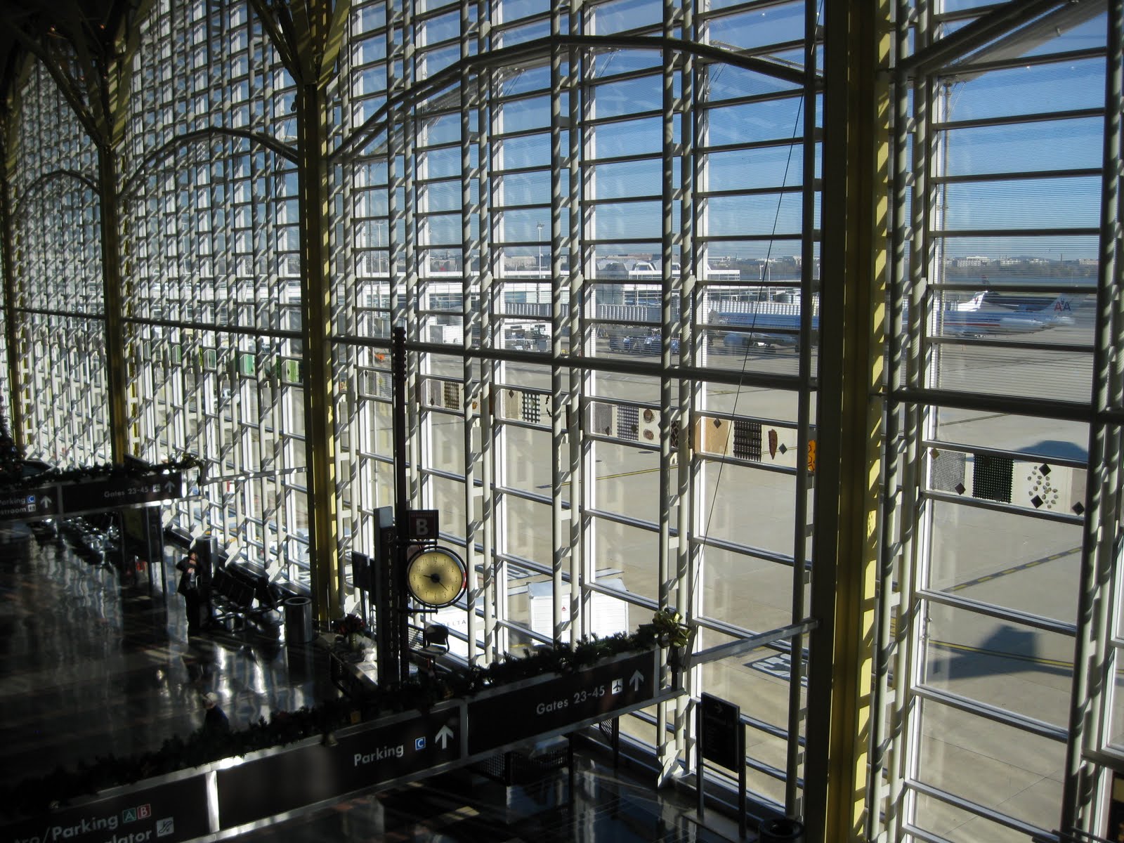
A big reason is all the horizontal lines used everywhere in the design. Stretching across windows and walls from floor to ceiling, they create a prison-like atmosphere, as if Pelli's main thematic inspiration was that ubiquitous symbol of urban angst, the crash gate. And the net effect is to uglify the space.
Just look at how the horizontal lines weigh down the terminal's big glass windows that look out onto the tarmac:
We have these enormous windows bringing us out onto the field and letting us see for miles, showcasing aircraft and action, and potentially lending a sense of excitement to the experience of flying in or out of the city. So why clog up the views with heavy horizontal lines that serve no structural purpose? The potentially inspiring vistas are ruined by row upon row of bars that remind me of, yes, crash gates, or maybe the bars across the windows of passenger trains in India:

In India, the horizontal bars keep people from entering or leaving through the windows. At National Airport, the horizontal bars serve nothing more than an inane and dehumanizing design scheme that turns a potentially inspiring space into an ersatz Stalag 17.
What's wrong with horizontal lines and windows and spaces? To massively oversimplify, the vertical mimics the human form (we stand upright), while the horizontal negates it. We are a vertical race, and the vertical (in doors, in windows, everywhere) works in concert with our humanity. The horizontal does not. And I feel this distinction is especially important in a transportation hub if the aim is to create a space that celebrates the human component (the start or end of momentous journeys, the meeting of friends and family) as well as the inspirational: the dream and wonder of flight, which has tragically vanished from commercial aviation today, at least in the United States.
Put another way: Vertical lines and spaces uplift and inspire. Horizontal lines and spaces inhibit and imprison. Back at National, consider the use of horizontal lines encasing these escalators:
Not only do Pelli's horizontal shapes mimic the dimensions of a human coffin, but, incredibly, many here are filled with a frosted material that blocks the view to the outside. Trying to add to the uncertainty of the experience, or make people feel they're in a prison? Mission accomplished.
So, although the scale and intentions of this facility are laudable, the details render it truly depressing. Consider the "horizontal coffin" motif as employed when travelers first arrive at the main terminal for a flight:
What kind of an inspiring welcome is this? Does it say "magic miracle of flight" or "abandon hope all ye who proceed?" People arriving at National for the first time, confronted by these blank walls with the small horizontal slit of glass, are made to feel like they're entering not an airport, but a federal penitentiary.
The horizontal coffin motif continues everywhere, overrunning the terminal like architectural kudzu. Look what it does to a long connecting walkway, hemming you in and interrupting the view:
And here it is cladding the control tower, for Pete's sake, making it look like some kind of giant-sized ribbed sex toy:
Worst of all, I think, is how this horizontal coffin motif obstructs the main terminal's large windows that overlook the busy tarmac. Instead of bringing passengers closer to the action, the windows act now as a barrier, as if to say, "In no way is the experience you're about to have worth looking at or savoring, even for just a moment."
It's all made worse, if you can believe it, by public art. Apparently what's going on outside on the airfield is so uninteresting that a strip of abstract designs must run across the entire length of the window, further obscuring the view.
Geez, I don't know honey -- are there planes out there somewhere? And if public art isn't enough, the windows are further obscured by sales kiosks and info booths and video screens that further mar the concept and take up valuable ground-level space.
It's bad enough that the windows are so blocked up, but even the terminal's potentially impressive interior space is diminished by unnecessarily heavy ground-level signage that spans the entire corridor and obstructs the vistas:
The only place where you get a real sense of the building's impressive scale is from the ticketing and check-in area on the second level, which at least brings your eye in above the signage and allows you feel like you're entering a worthy cathedral of transportation, a place where great journeys originate or conclude:
However, it also brings you in close to the terminal's bizarre and intimidating ceiling design, which is festooned with alarming shapes that somehow remind me of the "fizzy lifting drink" testing facility in 'Willy Wonka and the Chocolate Factory' (1971):
These oversized sheet metal leaf clusters might be intended to represent flight, but instead they serve to make a person feel tiny as they seem about to collapse right on top of you. And how about those "Jeffersonian domes" that make up the ceiling? I read where Pelli was trying to create something that harmonized with other architecture in Washington, but someone should have realized that the domes, with their portholes and archways, lose their singular purpose of focusing a space when they're placed one after another after another in a long row. Sheesh!
Speaking of the desire to "harmonize" with Washington, D.C., all the rest of it seems to be empty gesture. Take, for example, the recurring motif of the "false arch," which not only further clutters the terminal's main windows, but also weighs down entranceways and walls like this:
It's like a cartoon version of our nation's capitol. The fax five-sided arches are even applied as outdoor canopies in the lower level, even though the space is already completely shielded from the elements by the overhead roadway:
Speaking of harmony, right near this area is a retail space that's been built out in a style that's completely at odds with Pelli's post-modern structural homage:
Oops! Ironically, the faux column is more in harmony with a lot of Washington's federal architecture than anything in Pelli's terminal. Even Pelli's colors seem odd: what do hues of caramel and light blue have to do with Washington, D.C.?
A deliberate effort was made to incorporate public art into the facility, which is nice, but the execution is dismal. Consider this mosaic on the terminal floor, which is not noticed by people who walk over it and is too detailed for anyone on the balcony above to make any sense of:
The way people blithely walk over it reminds me of how Saddam Hussein once had a portrait of the first George Bush in an entryway of one of his homes as a sign of contempt. Here, it's like someone who hates art figured out the most ineffective way to display it to confirm its uselessness: "So you want art? There's your art! Hope it makes you happy!"
And there's so much else, although not all of it is a function of the terminal's design. How about the position of these seats at the edge of the balcony. Not only do the railings block any kind of view you might have to the crash-gate windows beyond, but the issue of legroom is no longer confined to the aircraft cabin, apparently:
And there's at least one really nice feature that you don't often see. Too often, baggage claim areas have the ambiance of sub-basements, making for a rather dim arrival. But in a few places, National's baggage areas are open to the terminal above.
This is a welcome breath of fresh air. Unfortunately, it's in a terminal that's otherwise oppressive and weighed down by empty gestures.
But wait! Maybe I'm missing the point. In this age of "less government is better," perhaps Pelli's terminal is ironic commentary on the ultimate ineffectiveness of federal government. Perhaps the endless repetition of horizontal coffin shapes that resemble banks of crash gates are meant to symbolize...oh, never mind.
Take it all in, and what should be an inspiring space makes one feel as if one is a gerbil making one's way through a Habitrail complex. You feel constrained, not liberated. You feel hemmed in, not ready to fly. What a missed opportunity, especially when a wonderful old-school example is just next door, in the form of the original pre-jet age National Airlines Terminal, now spiffily restored and often rented out for functions, as it was the day I passed through.
Look at the difference! The space, though on a smaller scale, is far more impressive and substantial. The vertical showcase the airside activity, practically inviting you to step through and onto the tarmac, as opposed to the Pelli terminal's cage-like effect. The simple ceiling, rather than festooned with sheet metal gimmickry and meaningless "Jeffersonian domes" that cancel each other out, does not draw attention to itself at all, and is far more satisfying. Less is more. It's orderly and inspires confidence. And the slight curve of the space (and the window) does more to create energy than a ton of public art.
Sadly, the remaining "non-modern" part of National (I just can't bring myself to call it "Reagan National Airport" because that just sounds silly to me) is probably the very worst airline space on the U.S. east coast. Known as 'Terminal A," it's like a directory of outdated contemporary design trends of about 40 years ago, all pre-formed concrete and textured stone wall covering and weird disturbing shapes that seem to have melted in place:
Yes, I like to see the process of getting to a departure gate as similar to getting sucked through the bowels of an abominable snowman:
What once might have evoked the splendor of the pre-deregulation jet age is now a tired shell that's slated, mercifully, to be torn down and rebuilt. In the meantime, hurry on down to National to see vistas such as this:
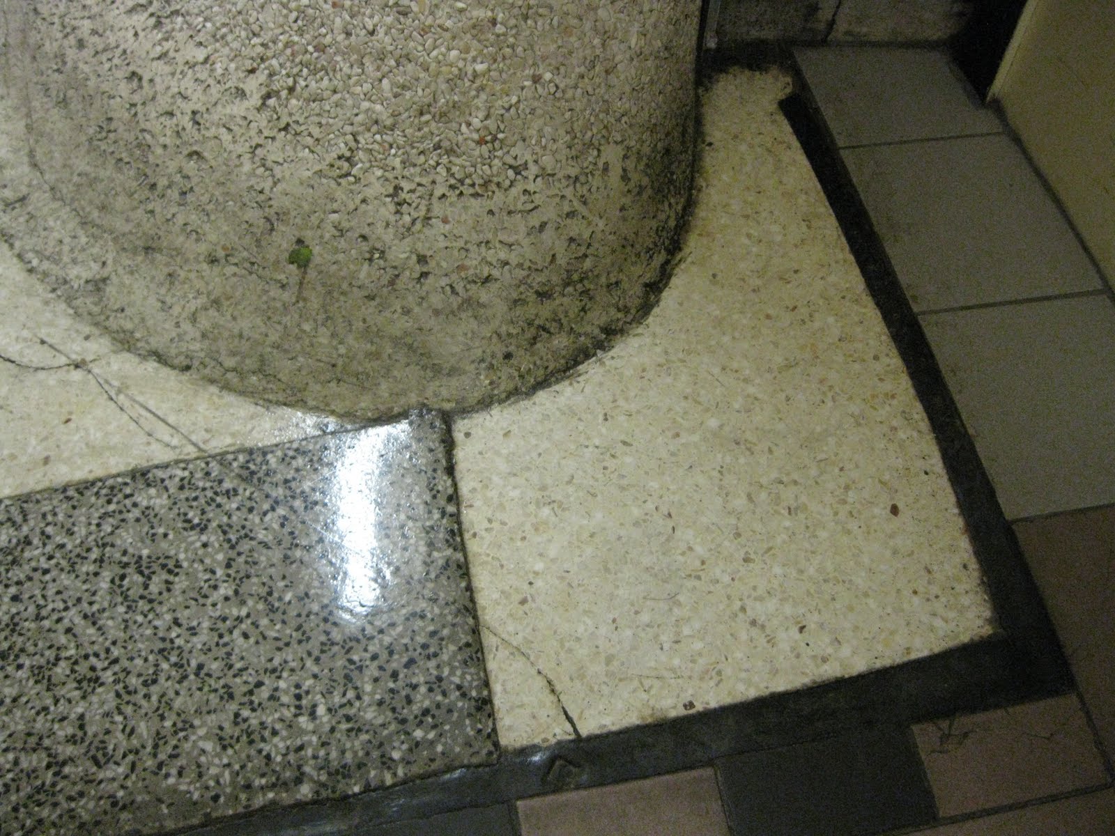
By the way, one of the most interesting things about white textured stone as a wall covering is that it's a work in progress, especially when joined to the floor in a curving swoop. For instance, how long as this wad of gum (that green splotch at about 10 o'clock) been stuck there? Will it ever be removed, or will it be joined by something else?
If you stick your gum there, take a picture and send it along!
Friday, October 14, 2011
Albuquerque's Sunport and a sidetrip to Santa Fe
Albuquerque's airport is the noisiest I've ever been in. It's not because of the usual complaint of TVs blaring throughout the concourse. It's the floors.
Albuquerque's 'Sunport,' a handsome complex, has actual brick floors throughout the terminal -- before security, after security, in the bathrooms, everywhere. A touch of southwestern style, I guess.
But when a planeload of passengers all tramp by you en masse with their roller bags, the sound is very much like what happens when you drive on highway rumble strips.
BRAA-GAAA-GAAA-RRRR-RRRR-BRAA-GAAA-GAAA and so on, until the plane empties. And until another one comes in.
Chalk it up to unintended consequences. But still, it doesn't take much away from a nice airport that makes a nice effort to act as a distinctive gateway and an easy-to-use facility.
Not being a hub, the place has only a handful of flights from each of the major carriers, many of them regional jets. But Southwest has long had a presence in Albuquerque, and operates something like three dozen flights a day, or about half the airport's total. (In that sense, Albuquerque is rather like my hometown airport, Manchester-Boston Regional.)
So it's busy enough, but still gets by with a single terminal and two-prong pier. Simple and efficient, and the "grand entrance" is a two-story space about the size of a high school gym, with a replica of an early aircraft hanging from the wooden rafters. Nice!
Post-security, the gate concourse is divided into two piers, with a rather ambitious sculpture acting as a dividing point. It sets the right tone, though it's boxed into a relatively cramped atrium, and is lit from above, making it easy to ignore.
There's some construction going around the sculpture, which led to some partially obscured signage. If you're looking for the "nge," it's this way.
The flight info displays are state-of-the-art, but they're enclosed in framework of glass panels etched with a local pattern. (The garbage cans lined up in front take away from that, but they've got to go somewhere.)
And, thankfully, the windows aren't horizontal, but actually provide a good view of the tarmac action. The place seems a little earthbound, but then again the regional "abode" style of construction doesn't really lend itself to glass and air and sunlight, does it?
I like the Albuquerque Sunport. When my wife and I arrived, the flight was late, but at least the airport made us feel we'd arrived somewhere distinctive, and told us a little about what kind of a place it was. That was nice, since in the dark, it would have been hard to tell otherwise.
A side trip to Santa Fe: About an hour's drive north of Albuquerque is Santa Fe, state capital of New Mexico and one of the oldest European settlements on the continent. While most people go there for the art scene, airport enthusiasts will be glad to know that Santa Fe is home to a beautifully intact and fully functioning mid-20th century airline terminal, painted a pueblo beige and complete with control tower on top.
Although overshadowed by Albuquerque's busy Sunport to the south, the capital's airport has long enjoyed some level of commercial air service. At one point, TWA ran many flights through here. Lately, the trend has been on the light side. A few years back, no airlines at all stopped here. Today, it's a grand total of three on American Eagle: two to Dallas and one to Los Angeles. And that's it.
AS a result, Santa Fe's airport hasn't felt the need to expand or change or upgrade, other than to accommodate stricter security. You still just drive right up the terminal or park right next to the tarmac and walk across the road to catch your flight. Need a rental car? They there are, all lined up, steps from the counters inside.
The place was pretty quiet when we stopped by -- no flights just then. I moseyed through the darkened ticket counter space to find a boarding area that looked like the dining room of a well-to-do rancher: high beamed ceilings, simple hung-wheel chandelier, southwest style decorator touches, and a hanging model of the original Boeing 707 Air Force One.
Oh -- and a body scanner.
Thursday, September 29, 2011
Phoenix Airport: A Tale of Two Concourses
Seen from the air, Phoenix is a mirage by way of Pee Wee Herman. After flying a thousand miles over desolation, you're suddenly banking low over a cartoony patchwork of deep green lawns and dusty vacant lots and bright blue swimming pools. It's a place where tidy aqueducts surface for short stretches and then dive underground again, where gated neighborhoods jammed with mansions sit adjacent to trailer parks, the whole of it baking under an unyielding afternoon sun. (But it's a dry heat!) As our Southwest 737 lined up for a landing at Sky Harbor International, the place looked like nothing I'd ever seen. Which what I expected.
About the airport: it's a disappointment, but with one astounding exception. Much of Sky Harbor has the dim, uninspiring feel of a shopping mall from the 1970s. But all that blandness is nearly balanced out by a single concourse that must rank as one of the great airport spaces in North America, if not the world. Read on.

Sky Harbor's a busy place -- home to a U.S. Airways hub, an important station for Southwest (the airline's fourth-busiest, after Chicago Midway, Las Vegas, and Baltimore), and substantial flight operations by all other major U.S. carriers. British Airways gets into the act with non-stop flights to Heathrow. It's the ninth-busiest airport in the nation, handling nearly 40 million passengers a year. So you'd expect such an important gateway to host a pretty substantial airport.
Well, think again. Our flight (Southwest from Chicago Midway) pulled up to a C Concourse gate in Terminal 4, a sprawling complex that handles about 80 percent of the airport's traffic. Stepping off the jetway, my first experience of Phoenix was classic American nowheresville: low ceilings, fluorescent lights, dull carpeting, few windows, and almost nothing to mark a traveler's arrival in the great American southwest.

Phoenix? This could have been Pittsburgh or Portland -- Maine or Oregon, it wouldn't have mattered.
Our connecting flight (to Albuquerque) was in the D concourse, next one up, so off we went, following a long, straight characterless corridor. The next leg was running late, so I steeled myself for another soul-deadening boring airport layover. Imagine my surprise, then, when we turned the corner to enter the D concourse, and found this:

First impression: Holy cow! Light, air, clean lines, large windows that fronted onto one of PHX's parallel runways, where a Southwest 737 was just rotating up as it zipped past. And sky! You could see sky! Walking further in, I began picking up on details: the strange oversized canopies over each gate, the unique compass pattern of the floor tiles, the generous amount of public art (including a wacky and completely functionless arch), and all done in materials that reminded me of where I was in the world.

I had stumbled onto Concourse D, opened in 2005, the newest part of Terminal 4. The rest of the 80-gate complex dates back to 1990, apparently still the era of ugly airport architecture, at least in Phoenix. How anyone could build a completely new 80-gate airline terminal complex in 1990 and have it come out so blah is beyond me. Something to do with air conditioning, perhaps?

Back to the present: Concourse D has only eight gates, but it felt big. And open. And important. Passing through, coming or going, the place had enough good vibes going to make you feel like you were doing something special. Like all good transportation buildings, if functioned like a church: it bestowed significance. In its design, it said this: "Entering or leaving our city is an occasion that's important enough to take place in a fittingly grand setting."

It also said this: "If this concourse is any indication, the rest of Phoenix and the region served by this airport is one happening place."
Pretty good for a space with just eight gates. How did they do it? By paying attention to the big picture, I think, but not losing sight of details.
The layout is simple: a pier juts out onto the tarmac, four gates on either side. But the genius part is at the end of the pier. What usually happens here is that additional gates are clustered at the end to maximize the number of aircraft positions. Makes sense, but the result is often a blocked-in claustrophobic dead end, like you see here in Concourse C:

Well, not at Phoenix's Concourse D. Here, it ends in a giant window that extends from floor up to high ceiling, and offers unobstructed views of one of airports very active runways. This serves to reconnect travelers with the magic and power of flight, and creates an immense amount of excitement. As a bonus, it also floods the space with light. And, dear sweet mother of God, the windows panes are not the trendy but evil horizontal shape. Whoever make this decision chose right, thankfully avoiding the "window as fence in gulag or stockyard" look.
Paradoxically, the big window makes the concourse seem both infinite and intimate at the same time. The great wall of glass serves to include the outdoors as part of the space, making it seem grand. But it also acts as a natural gathering point, acting as a destination that naturally attracts visitors to it. Concourse D isn't that big, but the distance to Gate D8 out at the end doesn't seem nearly so bothersome when there's such a wonderful magnet drawing you there.

But there's more. Look up! Rather than a flat roof, Concourse D sports a creased top, with the lowest part running along the center and either side flaring up and out, which allows more glass, which means more sky and light. This design makes the place seem bigger, but it's more than that. By its appearance and shape, the roof helps the concourse celebrate the act of flight. (See the photos above.)
Let me explain. I think the best airport buildings find ways to use design to create anticipation and excitement through symbol and appearance. In a structure that stands completely still, they somehow capture the excitement of motion and the freedom of flight.
Good examples are the acclaimed terminals designed at the dawn of the jet age by Finnish architect Eero Saarinen: the ex-Trans World Airlines hub at New York's JFK Airport and the main terminal of the then-new Dulles International Airport outside Washington, D.C. Here's what they look like from the outside:


In both cases, Saarinen used the roof to create a dramatic space that expressed the magic of flight that really must have been present in the pre-deregulation age. (I got just the barest taste of that as a kid in the early 1970s, when our mother made my two brothers and me wear a coat and tie to fly coach to visit our uncle in Atlanta!)
Well, deregulation or not, the act of flight is still an age-old dream that we in the present day have realized. And the best airport spaces acknowledge and celebrate that -- something that I think is even more important in the age of security lines and packed airplanes and extra fees.
In Phoenix, Concourse D does this by literally opening up to the sky. The ceiling soars diagonally up and out, making us feel we're already airborne. It's quite a neat effect. And contrast that with, say, Denver, where the main terminal's signature white fabric tent peaks work exactly the opposite way, sloping down in all directions, making a traveler feel small and puny. (And which from a distance look like a pack of Ku Klux Klansmen. See below.)

In Phoenix, the ceiling crease is duplicated in the big window, by the way, which helps tie the whole place together and employing perspective to make it all seem so much bigger than it really is. It's like you're inside a box being unfolded. The central metaphor in all of this, I suppose, is that of a bird in flight. Maybe that's kind of simple-minded, but then sometimes simple is best.
Perspective is also used in four unconventional canopies gracing the boarding areas, two per gate, which looked to me like drawbridges being lowered. (Maybe that's the intent? After all, they're leading to gates.) These are slanted, but in the opposite direction of the ceiling, so they start high and drop lower. This has the effect of making the place seem even bigger!

Colors, materials, and details are all in harmony with each other, and with what you'd expect in the American Southwest. Bathrooms and eating places all worked well. Even so, the place is graced with some daring public art that challenges even as it welcomes.
For instance, the arch. I can't explain its purpose or its appearance. To me, it looked like an ice sculpture you might see at the Quebec Winter Carnival, and what that has to do with Phoenix, Ariz. is beyond me. But here's the thing: it stood guard over the entrance to the concourse, offering absolutely no barrier, as if in mockery of all the security checkpoints that rule air travel today. How refreshing to encounter something that says "Walk Right Through As Much As You Like!"

Also, the wall that backs up against the rest of the complex is filled with shiny metal abstract sculptures. I'm not prepared to explain their significance, either, but I can tell you the effect they produce, at least when I was there. With the late afternoon sun sinking low, all the light flooding in horizontally hit these things and then was scattered in a million different directions, filling the concourse interior with a kind of crystalline sunlight.

If I had one issue with Concourse D, it's that they didn't resist the temptation to install televisions in the gate areas. And once the sun goes down, they reflect off the darkened window glass, causing passengers to be surrounded with multiple images, sometimes of competing stations. Ugh.
I'm not sure if Concourse D seems so good because the rest of Phoenix Airport is so bad, but it's possible. The rest of Terminal 4 is a low-ceilinged pedestrian-unfriendly horror show. If nothing else, it acts as a symbol of the area it serves only in the sense that it's a desert of effective airport design.
We had time, so I took a walk around the whole place. It took forever, because, like Phoenix itself, Terminal 4 sprawls. Passengers switching concourses are forced on seemingly endless treks through long straight passages the exact opposite of Concord D -- they seem longer than they should, which is the last thing you want to do to add stress to a plane change.
I'll give them credit for at least keeping views open to the tarmacs and runways, and not cluttering up the passageways with retail kiosk that obliterate sightlines. (They save those for the actual concourses themselves.)
One thing they do do is treat travelers to historical aircraft info etched right onto the glass, giving you a chance to bone up on your B377 Stratocruiser trivia. Unfortunately, people on the moving walkways can't take them in (I missed them entirely until I finally noticed one), and those on foot and making a connection are probably too busy to care.

Any alternatives to schlepping insane distances on foot? Glad you asked! PHX is close to finishing a light rail line that will connect Terminals 2, 3, and 4 (what happened to 1?) with a remote parking area. Set to open in 2013, its distinctive feature is what airport officials claim is the only airport transit bridge in the world with enough clearance to handle the world's largest passenger aircraft. Guess they don't like tunneling in Phoenix. Anyway, the result is a taxiway that crosses over a terminal access road on a bridge, then goes under the new bridge. Here's a Frontier Airbus trying it on for size:

Otherwise, the rest of Terminal 4 is endless blah of lookalike concourses, emphasis on the endless. It's like a trip back in time to the world's largest mall but in the 1970s, but with the stores removed. (Darn! Just when I could have used some Orange Julius!)

Two things made the walk worth taking. I saw not one but two active shoeshine stands, a rarity in this kind of airport and something that provided at least a little character. Also, I happened to be there when the British Airways flight was in pre-boarding, so I checked out the airline's Upper Class lounge. What a hoot! Go up a stairway and through a door, and you're in Gatwick Airport, seemingly. There's tea and coffee, private wood-lined "callbox" kiosks for privacy in using the telephone, and a garrulous female attendant who encouraged me to look around.
I didn't get into the Terminal 4 terminal itself, but it's submerged underneath a parking garage and looks to be of the concrete-brutalism-this-is-the-future school of design, just like the rest of the place. It's a pity. If the rest of the airport matched Concourse D, you'd have a candidate for best airport in the nation, and one of the best anywhere.
About the airport: it's a disappointment, but with one astounding exception. Much of Sky Harbor has the dim, uninspiring feel of a shopping mall from the 1970s. But all that blandness is nearly balanced out by a single concourse that must rank as one of the great airport spaces in North America, if not the world. Read on.
Sky Harbor's a busy place -- home to a U.S. Airways hub, an important station for Southwest (the airline's fourth-busiest, after Chicago Midway, Las Vegas, and Baltimore), and substantial flight operations by all other major U.S. carriers. British Airways gets into the act with non-stop flights to Heathrow. It's the ninth-busiest airport in the nation, handling nearly 40 million passengers a year. So you'd expect such an important gateway to host a pretty substantial airport.
Well, think again. Our flight (Southwest from Chicago Midway) pulled up to a C Concourse gate in Terminal 4, a sprawling complex that handles about 80 percent of the airport's traffic. Stepping off the jetway, my first experience of Phoenix was classic American nowheresville: low ceilings, fluorescent lights, dull carpeting, few windows, and almost nothing to mark a traveler's arrival in the great American southwest.
Phoenix? This could have been Pittsburgh or Portland -- Maine or Oregon, it wouldn't have mattered.
Our connecting flight (to Albuquerque) was in the D concourse, next one up, so off we went, following a long, straight characterless corridor. The next leg was running late, so I steeled myself for another soul-deadening boring airport layover. Imagine my surprise, then, when we turned the corner to enter the D concourse, and found this:
First impression: Holy cow! Light, air, clean lines, large windows that fronted onto one of PHX's parallel runways, where a Southwest 737 was just rotating up as it zipped past. And sky! You could see sky! Walking further in, I began picking up on details: the strange oversized canopies over each gate, the unique compass pattern of the floor tiles, the generous amount of public art (including a wacky and completely functionless arch), and all done in materials that reminded me of where I was in the world.
I had stumbled onto Concourse D, opened in 2005, the newest part of Terminal 4. The rest of the 80-gate complex dates back to 1990, apparently still the era of ugly airport architecture, at least in Phoenix. How anyone could build a completely new 80-gate airline terminal complex in 1990 and have it come out so blah is beyond me. Something to do with air conditioning, perhaps?
Back to the present: Concourse D has only eight gates, but it felt big. And open. And important. Passing through, coming or going, the place had enough good vibes going to make you feel like you were doing something special. Like all good transportation buildings, if functioned like a church: it bestowed significance. In its design, it said this: "Entering or leaving our city is an occasion that's important enough to take place in a fittingly grand setting."
It also said this: "If this concourse is any indication, the rest of Phoenix and the region served by this airport is one happening place."
Pretty good for a space with just eight gates. How did they do it? By paying attention to the big picture, I think, but not losing sight of details.
The layout is simple: a pier juts out onto the tarmac, four gates on either side. But the genius part is at the end of the pier. What usually happens here is that additional gates are clustered at the end to maximize the number of aircraft positions. Makes sense, but the result is often a blocked-in claustrophobic dead end, like you see here in Concourse C:
Well, not at Phoenix's Concourse D. Here, it ends in a giant window that extends from floor up to high ceiling, and offers unobstructed views of one of airports very active runways. This serves to reconnect travelers with the magic and power of flight, and creates an immense amount of excitement. As a bonus, it also floods the space with light. And, dear sweet mother of God, the windows panes are not the trendy but evil horizontal shape. Whoever make this decision chose right, thankfully avoiding the "window as fence in gulag or stockyard" look.
Paradoxically, the big window makes the concourse seem both infinite and intimate at the same time. The great wall of glass serves to include the outdoors as part of the space, making it seem grand. But it also acts as a natural gathering point, acting as a destination that naturally attracts visitors to it. Concourse D isn't that big, but the distance to Gate D8 out at the end doesn't seem nearly so bothersome when there's such a wonderful magnet drawing you there.
But there's more. Look up! Rather than a flat roof, Concourse D sports a creased top, with the lowest part running along the center and either side flaring up and out, which allows more glass, which means more sky and light. This design makes the place seem bigger, but it's more than that. By its appearance and shape, the roof helps the concourse celebrate the act of flight. (See the photos above.)
Let me explain. I think the best airport buildings find ways to use design to create anticipation and excitement through symbol and appearance. In a structure that stands completely still, they somehow capture the excitement of motion and the freedom of flight.
Good examples are the acclaimed terminals designed at the dawn of the jet age by Finnish architect Eero Saarinen: the ex-Trans World Airlines hub at New York's JFK Airport and the main terminal of the then-new Dulles International Airport outside Washington, D.C. Here's what they look like from the outside:


In both cases, Saarinen used the roof to create a dramatic space that expressed the magic of flight that really must have been present in the pre-deregulation age. (I got just the barest taste of that as a kid in the early 1970s, when our mother made my two brothers and me wear a coat and tie to fly coach to visit our uncle in Atlanta!)
Well, deregulation or not, the act of flight is still an age-old dream that we in the present day have realized. And the best airport spaces acknowledge and celebrate that -- something that I think is even more important in the age of security lines and packed airplanes and extra fees.
In Phoenix, Concourse D does this by literally opening up to the sky. The ceiling soars diagonally up and out, making us feel we're already airborne. It's quite a neat effect. And contrast that with, say, Denver, where the main terminal's signature white fabric tent peaks work exactly the opposite way, sloping down in all directions, making a traveler feel small and puny. (And which from a distance look like a pack of Ku Klux Klansmen. See below.)

In Phoenix, the ceiling crease is duplicated in the big window, by the way, which helps tie the whole place together and employing perspective to make it all seem so much bigger than it really is. It's like you're inside a box being unfolded. The central metaphor in all of this, I suppose, is that of a bird in flight. Maybe that's kind of simple-minded, but then sometimes simple is best.
Perspective is also used in four unconventional canopies gracing the boarding areas, two per gate, which looked to me like drawbridges being lowered. (Maybe that's the intent? After all, they're leading to gates.) These are slanted, but in the opposite direction of the ceiling, so they start high and drop lower. This has the effect of making the place seem even bigger!
Colors, materials, and details are all in harmony with each other, and with what you'd expect in the American Southwest. Bathrooms and eating places all worked well. Even so, the place is graced with some daring public art that challenges even as it welcomes.
For instance, the arch. I can't explain its purpose or its appearance. To me, it looked like an ice sculpture you might see at the Quebec Winter Carnival, and what that has to do with Phoenix, Ariz. is beyond me. But here's the thing: it stood guard over the entrance to the concourse, offering absolutely no barrier, as if in mockery of all the security checkpoints that rule air travel today. How refreshing to encounter something that says "Walk Right Through As Much As You Like!"
Also, the wall that backs up against the rest of the complex is filled with shiny metal abstract sculptures. I'm not prepared to explain their significance, either, but I can tell you the effect they produce, at least when I was there. With the late afternoon sun sinking low, all the light flooding in horizontally hit these things and then was scattered in a million different directions, filling the concourse interior with a kind of crystalline sunlight.
If I had one issue with Concourse D, it's that they didn't resist the temptation to install televisions in the gate areas. And once the sun goes down, they reflect off the darkened window glass, causing passengers to be surrounded with multiple images, sometimes of competing stations. Ugh.
I'm not sure if Concourse D seems so good because the rest of Phoenix Airport is so bad, but it's possible. The rest of Terminal 4 is a low-ceilinged pedestrian-unfriendly horror show. If nothing else, it acts as a symbol of the area it serves only in the sense that it's a desert of effective airport design.
We had time, so I took a walk around the whole place. It took forever, because, like Phoenix itself, Terminal 4 sprawls. Passengers switching concourses are forced on seemingly endless treks through long straight passages the exact opposite of Concord D -- they seem longer than they should, which is the last thing you want to do to add stress to a plane change.
I'll give them credit for at least keeping views open to the tarmacs and runways, and not cluttering up the passageways with retail kiosk that obliterate sightlines. (They save those for the actual concourses themselves.)
One thing they do do is treat travelers to historical aircraft info etched right onto the glass, giving you a chance to bone up on your B377 Stratocruiser trivia. Unfortunately, people on the moving walkways can't take them in (I missed them entirely until I finally noticed one), and those on foot and making a connection are probably too busy to care.
Any alternatives to schlepping insane distances on foot? Glad you asked! PHX is close to finishing a light rail line that will connect Terminals 2, 3, and 4 (what happened to 1?) with a remote parking area. Set to open in 2013, its distinctive feature is what airport officials claim is the only airport transit bridge in the world with enough clearance to handle the world's largest passenger aircraft. Guess they don't like tunneling in Phoenix. Anyway, the result is a taxiway that crosses over a terminal access road on a bridge, then goes under the new bridge. Here's a Frontier Airbus trying it on for size:
Otherwise, the rest of Terminal 4 is endless blah of lookalike concourses, emphasis on the endless. It's like a trip back in time to the world's largest mall but in the 1970s, but with the stores removed. (Darn! Just when I could have used some Orange Julius!)
Two things made the walk worth taking. I saw not one but two active shoeshine stands, a rarity in this kind of airport and something that provided at least a little character. Also, I happened to be there when the British Airways flight was in pre-boarding, so I checked out the airline's Upper Class lounge. What a hoot! Go up a stairway and through a door, and you're in Gatwick Airport, seemingly. There's tea and coffee, private wood-lined "callbox" kiosks for privacy in using the telephone, and a garrulous female attendant who encouraged me to look around.
I didn't get into the Terminal 4 terminal itself, but it's submerged underneath a parking garage and looks to be of the concrete-brutalism-this-is-the-future school of design, just like the rest of the place. It's a pity. If the rest of the airport matched Concourse D, you'd have a candidate for best airport in the nation, and one of the best anywhere.
Subscribe to:
Posts (Atom)