Independent critiques about airline terminals and other transportation facilities.
Showing posts with label Terminal. Show all posts
Friday, December 21, 2012
Surprise! Albany's impressive train station
It may not be located downtown, but Albany, N.Y. has one impressive train station.
Climbing up from the platforms, arriving passengers enter a grand hall that feels unexpectedly monumental. It's way better, for example, than what Amtrak is stuck with at Penn Station in New York City.
All this for Albany?
Well, yes. Albany claims to be the ninth-busiest station in the whole Amtrak system (a statistic I found on ever-reliable Wikipedia), something that seems rather surprising at first glance.
But then again, it makes sense when you consider that Albany boasts a level of passenger rail service that most small cities in the United States haven't seen since World War II.
Not only does the Capital Region enjoy frequent service to Penn Station (14 round-trips each weekday, according to the current Amtrak timetable), but it also maintains frequent service to Buffalo (three trains daily each way), as well as nightly service west to Cleveland and Chicago (sleeper on the Lake Shore Limited, anyone?), east to Boston, and north to the thriving metropolis of Rutland, Vt.
Add in two exotic international trains that cross the Canadian border – the Maple Leaf to/from Toronto and the Adirondack to/from Montreal, which both pass through here each day – and you've got yourself a schedule that most cities of similar size would envy.
So it adds up to one busy place – about 700,000 rail passengers a year, again according to Wikipedia. And things will only get busier due to a recent agreement with freight carrier CSX for Amtrak to take control of the tracks from here south to Poughkeepsie, a big chunk of the route to New York City.
This will improve dispatching and also clear the way for track improvements to speed up travel time to/from the Big Apple, so more service is planned for the future – so much so that a fourth platform is planned in additional to the existing three.
Just as the level of passenger service evokes a bygone era (a nightly sleeper to Chicago?), so does the passenger terminal. It's big – not quite cathedral scale, but big enough to give the Capital Region a rail gateway that the community can be proud of.
The main hall, ringed by balconies and sporting an impressively tall windows, has a genuinely grand feeling. The peaked roof soaring above evokes a feeling of being in some great Gothic hunting lodge or library. The tall windows looked impressive and inspiring even in the darkness.
The colors work together like players in a string quartet: elegant pink granite, rich brown wood, green-painted steel structural and ornamental elements, cream-colored walls, all of it anchored and reflected and amplified by very attractive designs in the floor tiling.
And it's a busy enough place to support a nice range of retailers, including a full sit-down restaurant, a big bookstore/newsstand, and other shops. It was enough to be useful, anyway, to those of us on the Lake Shore Limited (Boston to Chicago, with a two-hour layover in Albany) who wanted to escape the train for awhile and wander around.
All this in a station that, praise be, was actually designed and built in the modern era, opening in 2002.
I'd been through it before, but never had a chance to explore the station since it opened. (In earlier days, my primary memories of Albany are of the downtown bus station, which I used to visit a girlfriend. Later, while in college in the 1980s, I would take Amtrak from NYC up to visit a high school friend at Rennsalaer Polytechnic Institute, but I recall the station being little more than a platform in the middle of nowhere.
Of course prior to all this, Albany was home to Albany Union Station, an enormous Beaux Arts station from the late 19th century right in center of downtown. Here it is:
With rail service in decline, then-tenant Penn Central moved out in December 1968, and the majestic building fell into serious disrepair. Fortunately, a bank renovated it in the 1980s, and it's back in business today, though not as a rail station.
Which takes us back to the present station, about a mile-and-a-half away and across the Hudson from downtown Albany. Although it was dark, I ventured out front to see if the station's exterior lived up to the inside. I wasn't disappointed. The place has the same feel – a structure of consequence that gives the feeling that something important happens here.
And perched high above the main entrance was, yes, a giant clock (non-digital) with four sides that must have been visible from some distance. The faces were lit, too and each seemed to be displaying the correct time, too.
Yes, I suppose overall the place does have a kind of modern synthesized Disney World feel to it. The clock tower in particular looks like something out of sci-fi movie – or maybe a giant pencil eraser. In terms of a local reference point, it might be a kind of stripped-down version of the Governor's Mansion:
Is this...
...an homage to this?
Perhaps this feeling is a function of the place just being so – well, new. After all, we don't see many brand spanking new train stations in this country anymore.
In fact, the only other one I can think of is the big new Lautenberg transfer station in Secaucus, N.J, which rises out of the marshes and does its best to channel the ghost of the original Penn Station, the next stop on the line. The Lautenberg station, too, feels kind of theme-park-ish, perhaps just by virtue of its newness. But hey – it took Grand Central Station a century to become the Grand Central Station we know today.
One element that adds to the station's role as a transport hub is a surprisingly robust bus service. I remember my RPI friend joking about the local bus system's inane radio commercials, but there seems to be a heckuva lot more options than in my hometown of Manchester, N.H. Check out the rack of timetables!
Maybe it helps to be the capital city of the “Empire” state, with all the prestige (and money) that comes with it. Maybe it's no coincidence that the Albany area also boasts a first-rate airport with a wonderful contemporary terminal, as well. (I passed through there in March, 2012.)
Minor quibbles: the bridge above the platforms forms a kind of airline gate waiting area, complete with TV set droning on. Lose it!
But no matter. Albany's train station is a delightful surprise, especially in the context of the revenue-starved state of passenger rail service in the United States. In some places, the detail is extraordinary, such as this frosted and gridded ceiling on the stairways down to the platform.
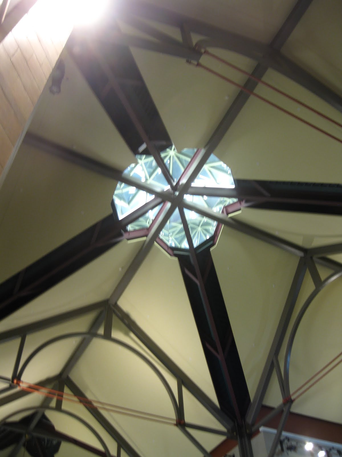
I would love to see it during the day, with sunlight flooding not only the stairwells, but streaming through the giant windows and down from the glass cupola set way up in the ceiling, like some kind of oversized lighthouse.
So take a lesson from Albany, other cities. A passenger rail station erected in our lifetime does NOT have to have the inspiration and ambiance of a Quonset hut. No indeed – it can be an inviting beacon of light and space, which is certainly was when I passed through.
Monday, March 19, 2012
Syracuse Airport (SYR): Help wanted
A typical still life at Syracuse Airport.It wouldn't be fair to say much about Syracuse (N.Y.) Hancock International Airport right now, as the main terminal building is undergoing a refurbishment that's scrambled the place somewhat. But during a recent visit (Sunday, March 18, 2012) while passing through the area, I found a lot that looks like it won't change anytime soon, including a monumentally ugly concrete canopy that gets my vote for the single worst feature of any airline terminal I've ever encountered in North America.
Eager for more? Let's go!Syracuse is a bigger city than you might expect (145,000 people in town, more than 600,000 in the area), so you'd assume the region would be eager to make a good impression to visitors. Home to Syracuse University (duh!), it's also where a lot of military personnel pass through on their way to and from Fort Drum. So you'd think Syracuse would support a robust air service.
You'd think. Well, Syracuse, like many small and mid-size airports, has seen a recent decline in air service, to the point where the majors rely on regional jets almost exclusively. It's not exactly booming, so there probably isn't a lot of revenue available for improvements. And that's too bad, because what Syracuse has now is a weird set-up: a tired main terminal from the pre-deregulation era that's been almost completely swallowed up by ill-planned add-ons, in front and on both sides.
The airlines occupy space in newer wings on either side of the original terminal. Each wing features a two-story ceiling, but any grandeur is hobbled by a series of strange-looking circular beams that stretch across the space. They're can't be structurally needed, so the question arises: "What were they thinking?"
After check-in, passengers must ascend to the second level, where they cross over the ticketing hall. Here we go up the escalator, accompanied by sad-looking vegetation in bulbous stepped planters that resemble giant urinals:
And what says upstate New York more than palm fronds?
And get a load of that white cladding, which is all over the place. It makes everything else look dirty in comparison, especially the gray flooring, which may have been washed an hour ago but would still look dirty and depressing. The white even succeeds in making the dirt in the planters look dirty, but I digress.The escalator tops out on a walkway over the check-in area below, but you can't see anything because those white beams are positioned exactly right to block the view! Again: "What were they thinking?"
About all that white...let's see, Syracuse produced most of the nation's salt up until 1900. Is this a reference? Well, whatever the reason, all the relentless white makes the place feel like a clean room that's not really that clean.
Speaking of charm: How's this for a weird, uninviting space? What's with the bank of track lighting under the escalator?
I really don't know how much of this is temporary, but a lot of it seems the result of badly planned add-ons over the years that created weird cul-de-sacs and uninviting dank corridors — too many for a relatively small airport:
Hey, where is everybody?Upstairs, passengers headed to the two gate piers are confined to a world of low-ceilinged security areas and gate concourses. Prior to security, each area has a single skylight, a futile gesture to open up the space which seems to somehow only add to the gloom, even on the sunny day I passed through.
Meanwhile, the original terminal, which still could be the grandest space in the airport, is completely dominated on one side by a long row of rental car counters.
Their location serves to completely block the terminal's original curbside windows, giving the space basement-like qualities and causing the ceiling to loom alarmingly overhead. Instead of a place flooded with the afternoon sun, we're in a dank cavern cut off the from outside world, especially the sky we're about to travel through.
Might this be a temporary situation due to the construction? Alas, the facilities look pretty permanent. So what should be the terminal's grandest space, a showcase for the airlines serving Syracuse, is instead a grim corridor, retrofitted for the rental car trade. Meanwhile, airlines make do with cramped quarters in either wing, with ticket counters right next to baggage claims. Upstairs, each side of the terminal leads to its corresponding gate concourse. Judging from a sign in the old main terminal, it looks like the long-term vision is to open up the rear of the main building into one central security point, which makes sense.
But there's no evidence the airlines themselves are moving back into the central area. Instead, it'll continue to occupied by the rental car counters (at least they're convenient) and the airport's one large newsstand/coffee shop, seen below:
Both of these operations back up against the front glass wall of the original terminal, obliterating any sense of retro grandeur that might be possible in the old gal. The store, with its redundant curved ceiling, reminded me of the clamshell ticket counter installed during the latter years of New York's old Pennsylvania Station in a misguided attempt to update it.
Want to get any sense of the old terminal? Look up. The ceiling and the distinctive folded roof, with its little peaks of glass, are still there, though hardly noticeable.
Instead, the space is defined by strange vistas such as this:
Nothing says patriotism like a tiny flag mounted on a temporary wall.Whatever the plans are to update the terminal's interior, I can't imagine they'd be enough to overcome what I consider the single most depressing feature I've seen in any U.S. airport. It's the incredibly ugly concrete canopy that partially covers the arrivals/departures roadway in front of the terminal. It has the effect of turning a trip to the airport into a ride through a ghetto warehouse district.
Even a sunny day is turned grim!This is where you alight to begin your journey? This is where you step outside after your flight and are welcomed to the Syracuse area? Through what seems to be the lower level service entrance?
There's so much wrong with this canopy, I hardly know where to begin. Its bulk blocks the main terminal. Its roof blocks the light. It just looks ugly: bare or painted concrete beams streaked with grime, all supporting a ceiling high enough to make people feel puny and low enough to seem oppressive. Presumably intended to shield passengers from the elements, it instead covers them in gloom, along with a steady rain of pigeon poop.
And it probably doesn't do much good shielding anyone from the elements because, incredibly, parts of the supporting structure are roofless! So the result is a network of exposed beams that provide even more roosting spots for pigeons and give the whole thing a desperate, unfinished feel. What happened here? Did the city run out of money? Arriving at the airport, the open gridwork only serves to remind us of the wonderful sky that the enclosed sections block out -- the sky that you will soon be magically flying through, but you wouldn't know that while making your way under this monstrous concrete canopy.
Strangely, the enclosure roof has tiny skylights. They let almost no light in, but do serve as nice and dry pigeon warming houses. Seen from above from the nearby parking garage, the whole contraption looks especially sad, with piles of pigeon poop visible under the skylights.
Look carefully, and you can see the old terminal's top just peeking over the canopy. What could have been a cool retro-looking building is now just hemmed in by sheer ugliness.
And what about the old main terminal's front? With the rental car concessions and the store now backing up to it, it's become nothing but a blank wall, no different from those dehumanizing chain drug store windows that for some reason are permanently blocked.
So this canopy is a truly inexplicable structure and yes, hands-down the ugliest thing I've ever seen at any U.S. airport. Even if they just got rid of it, I don't know what they could do to restore some dignity to the old terminal, what with its windows blocked and its floor space all clogged with concessions. It's a lost cause.About the parking garage, just briefly. It's a fright, all crumbling concrete and heaving pavement, but what can you expect in upstate New York's long snowy winters? The terminal's second-level gate areas are connected to walkways directly across the arrivals/departures road to the garage. Unfortunately, both walkways don't match the garage's levels, but arrive between floors in filthy stairwells, a depressing and confusing situation. Besides, what's the point of a walkway on the second level when all baggage and ticketing functions are on the lower level?
Speaking of the walkways, look what I found in one of them:
These modular seats are placed all over the terminal, but why would anyone sit here? Also, what are they supposed to represent? The importance of the centipede to Syracuse? Someone's lower intestine?How about this nifty arrangement?
And yes, even this hard-luck facility's stairwells are ugly, and potentially dangerous.
This one, a utilitarian box, was actually missing its door handle, and had to be opened by grabbing a sharp-edged hole in the metal housing. It slammed shut behind me with a painfully loud BANG, frightening the many poor pigeons trying to rest inside it.Wow! Ready to fly to Syracuse? In fairness, however, it's not all bad news. One nice surprise: the terminal and gate areas are configured in such a way as to allow visitors to get closer to an actual aircraft than any airport I know. Check out this view of a JetBlue Embraer 190, taken from a walkway right outside the terminal.
Also, the old terminal contains one stroke of genius amid all the clutter: a full-size set of landing gear right there for you to inspect up close. If an effective terminal helps instill a sense of wonder about flying, then this little gesture of bringing part of an aircraft actually inside the place is a terrific idea. Just the sheer size of the hardware reminds everyone the scale of the machines involved in this experience.
Speaking of machines: Aficionados of vintage video games should check out the Syracuse Airport's game room, where time stopped about 1988:
And yes, it's not completely fair to criticize a terminal that's under construction. But judging from the drawings on display, nothing in the plans will restore the main terminal's grandeur, or give passengers any sense of what Syracuse is or hopes to be. It won't be a place that celebrates the comings and goings of a community. Instead, it's just big mishmash.
So despite the renovations, this airport will likely limp along in really rough shape. Despite the planned improvements, there's not much they can do to make the place a worthy gateway to the area, other than tear it all down and start over.
I have a feeling this won't happen, given what's in place already and how long it's been allowed to languish. So here's a hit list of what they can do to remake the place on a budget:
1. Tear down the awful canopy, restoring the old terminal's front to full view.
2. Inside the terminal, remove the false roofs over the rental car counters and the store to open the space up to the sky.
3. Ditch the white look, or at least put in accent colors. Orange? (for Syracuse University?)
4. Turn the old terminal into a grand foyer for the community.
Is this really the best first impression Syracuse can make? I don't think so, but getting anything done about it won't likely be easy. As an example of how the value of an airport is so poorly understood here, consider this sculpture that sits alongside the main road to the terminal:

It's the first thing people see when driving in or out of the airport, and as such stands as some kind of symbol for the community. Me, I found it so baffling that I pulled over for a closer look.
What I found was a cluster of metal beams stuck on a platform, the whole affair painted silver, though with rust starting to peak through. Check out that base! There's no explanation, no context, no nothing. It just squats by the outbound roadway, saying loudly to one and all: "Welcome to Syracuse, home to pointless sculpture, confusing design, and deferred maintenance!"
Postscript: Since my visit, I've seen plans of the $50 million terminal rehab project underway. Thankfully, it appears the ugly concrete canopy will be removed! But it looks like the front windows of the main terminal will still be blocked by rental car kiosks and a restaurant. Well, let's hope these get altered so they aren't so instrusive. Removing their ceilings would be a good start.
Tuesday, December 6, 2011
Washington National: Of Crash Gates and Coffins
I'll say it right up front: Washington's National Airport is one of my least favorite anywhere. I've been through it a couple of times, and the ambitious main terminal, designed by Cesar Pelli and opened in 1997, leaves me cold. It's all empty gesture and lost opportunities, I think. A flight I took into National on Dec. 1, 2011 confirmed my past impressions: the place seems to go out of its way to quash any excitement about air travel.
Not that Pelli didn't swing for the fences. To create a completely new terminal worthy of the downtown airport of the nation's capital, he came up with a long multi-level main concourse with a huge glass wall that framed three gate piers, the busy airfield beyond, and the many landmarks of Washington D.C. across the Potomac.
Not a bad plan, and impressive in terms of how he got the big new facility, known for some reason as both Terminal B and Terminal C, to fit snugly into the airport's constrained footprint.
So why does this place not do it for me?
A big reason is all the horizontal lines used everywhere in the design. Stretching across windows and walls from floor to ceiling, they create a prison-like atmosphere, as if Pelli's main thematic inspiration was that ubiquitous symbol of urban angst, the crash gate. And the net effect is to uglify the space.
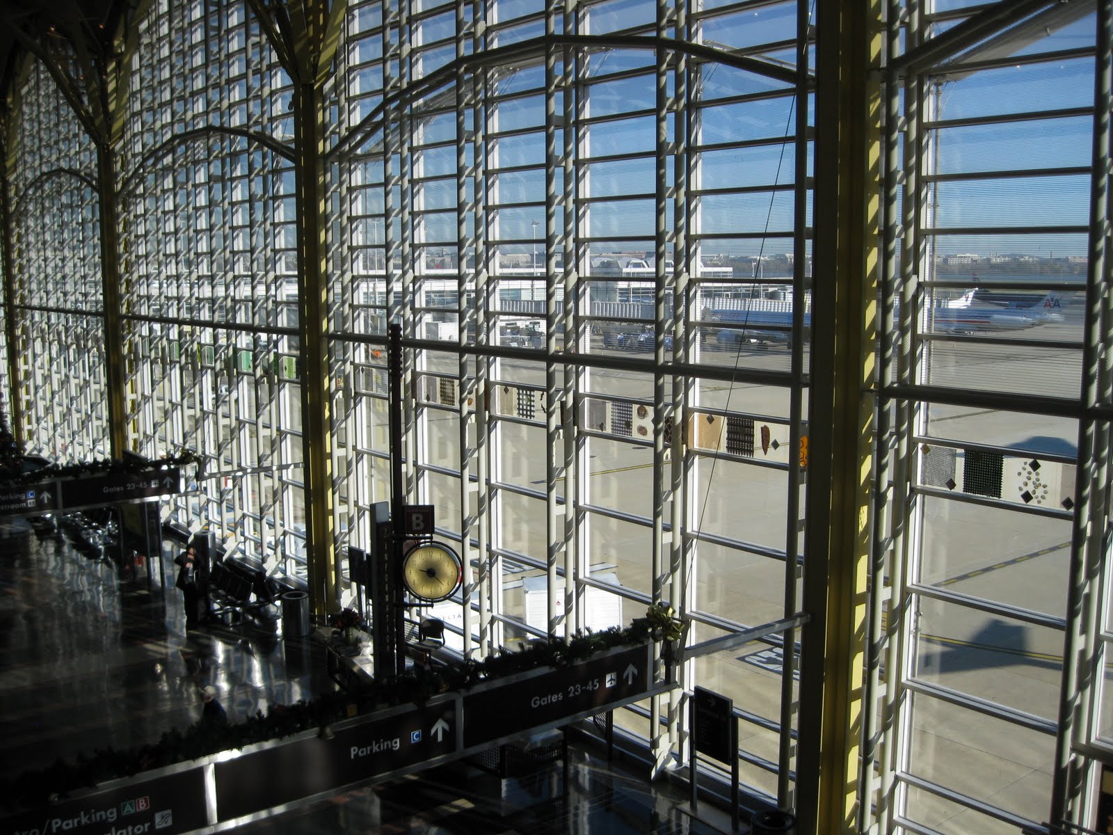
Just look at how the horizontal lines weigh down the terminal's big glass windows that look out onto the tarmac:
We have these enormous windows bringing us out onto the field and letting us see for miles, showcasing aircraft and action, and potentially lending a sense of excitement to the experience of flying in or out of the city. So why clog up the views with heavy horizontal lines that serve no structural purpose? The potentially inspiring vistas are ruined by row upon row of bars that remind me of, yes, crash gates, or maybe the bars across the windows of passenger trains in India:

In India, the horizontal bars keep people from entering or leaving through the windows. At National Airport, the horizontal bars serve nothing more than an inane and dehumanizing design scheme that turns a potentially inspiring space into an ersatz Stalag 17.
What's wrong with horizontal lines and windows and spaces? To massively oversimplify, the vertical mimics the human form (we stand upright), while the horizontal negates it. We are a vertical race, and the vertical (in doors, in windows, everywhere) works in concert with our humanity. The horizontal does not. And I feel this distinction is especially important in a transportation hub if the aim is to create a space that celebrates the human component (the start or end of momentous journeys, the meeting of friends and family) as well as the inspirational: the dream and wonder of flight, which has tragically vanished from commercial aviation today, at least in the United States.
Put another way: Vertical lines and spaces uplift and inspire. Horizontal lines and spaces inhibit and imprison. Back at National, consider the use of horizontal lines encasing these escalators:
Not only do Pelli's horizontal shapes mimic the dimensions of a human coffin, but, incredibly, many here are filled with a frosted material that blocks the view to the outside. Trying to add to the uncertainty of the experience, or make people feel they're in a prison? Mission accomplished.
So, although the scale and intentions of this facility are laudable, the details render it truly depressing. Consider the "horizontal coffin" motif as employed when travelers first arrive at the main terminal for a flight:
What kind of an inspiring welcome is this? Does it say "magic miracle of flight" or "abandon hope all ye who proceed?" People arriving at National for the first time, confronted by these blank walls with the small horizontal slit of glass, are made to feel like they're entering not an airport, but a federal penitentiary.
The horizontal coffin motif continues everywhere, overrunning the terminal like architectural kudzu. Look what it does to a long connecting walkway, hemming you in and interrupting the view:
And here it is cladding the control tower, for Pete's sake, making it look like some kind of giant-sized ribbed sex toy:
Worst of all, I think, is how this horizontal coffin motif obstructs the main terminal's large windows that overlook the busy tarmac. Instead of bringing passengers closer to the action, the windows act now as a barrier, as if to say, "In no way is the experience you're about to have worth looking at or savoring, even for just a moment."
It's all made worse, if you can believe it, by public art. Apparently what's going on outside on the airfield is so uninteresting that a strip of abstract designs must run across the entire length of the window, further obscuring the view.
Geez, I don't know honey -- are there planes out there somewhere? And if public art isn't enough, the windows are further obscured by sales kiosks and info booths and video screens that further mar the concept and take up valuable ground-level space.
It's bad enough that the windows are so blocked up, but even the terminal's potentially impressive interior space is diminished by unnecessarily heavy ground-level signage that spans the entire corridor and obstructs the vistas:
The only place where you get a real sense of the building's impressive scale is from the ticketing and check-in area on the second level, which at least brings your eye in above the signage and allows you feel like you're entering a worthy cathedral of transportation, a place where great journeys originate or conclude:
However, it also brings you in close to the terminal's bizarre and intimidating ceiling design, which is festooned with alarming shapes that somehow remind me of the "fizzy lifting drink" testing facility in 'Willy Wonka and the Chocolate Factory' (1971):
These oversized sheet metal leaf clusters might be intended to represent flight, but instead they serve to make a person feel tiny as they seem about to collapse right on top of you. And how about those "Jeffersonian domes" that make up the ceiling? I read where Pelli was trying to create something that harmonized with other architecture in Washington, but someone should have realized that the domes, with their portholes and archways, lose their singular purpose of focusing a space when they're placed one after another after another in a long row. Sheesh!
Speaking of the desire to "harmonize" with Washington, D.C., all the rest of it seems to be empty gesture. Take, for example, the recurring motif of the "false arch," which not only further clutters the terminal's main windows, but also weighs down entranceways and walls like this:
It's like a cartoon version of our nation's capitol. The fax five-sided arches are even applied as outdoor canopies in the lower level, even though the space is already completely shielded from the elements by the overhead roadway:
Speaking of harmony, right near this area is a retail space that's been built out in a style that's completely at odds with Pelli's post-modern structural homage:
Oops! Ironically, the faux column is more in harmony with a lot of Washington's federal architecture than anything in Pelli's terminal. Even Pelli's colors seem odd: what do hues of caramel and light blue have to do with Washington, D.C.?
A deliberate effort was made to incorporate public art into the facility, which is nice, but the execution is dismal. Consider this mosaic on the terminal floor, which is not noticed by people who walk over it and is too detailed for anyone on the balcony above to make any sense of:
The way people blithely walk over it reminds me of how Saddam Hussein once had a portrait of the first George Bush in an entryway of one of his homes as a sign of contempt. Here, it's like someone who hates art figured out the most ineffective way to display it to confirm its uselessness: "So you want art? There's your art! Hope it makes you happy!"
And there's so much else, although not all of it is a function of the terminal's design. How about the position of these seats at the edge of the balcony. Not only do the railings block any kind of view you might have to the crash-gate windows beyond, but the issue of legroom is no longer confined to the aircraft cabin, apparently:
And there's at least one really nice feature that you don't often see. Too often, baggage claim areas have the ambiance of sub-basements, making for a rather dim arrival. But in a few places, National's baggage areas are open to the terminal above.
This is a welcome breath of fresh air. Unfortunately, it's in a terminal that's otherwise oppressive and weighed down by empty gestures.
But wait! Maybe I'm missing the point. In this age of "less government is better," perhaps Pelli's terminal is ironic commentary on the ultimate ineffectiveness of federal government. Perhaps the endless repetition of horizontal coffin shapes that resemble banks of crash gates are meant to symbolize...oh, never mind.
Take it all in, and what should be an inspiring space makes one feel as if one is a gerbil making one's way through a Habitrail complex. You feel constrained, not liberated. You feel hemmed in, not ready to fly. What a missed opportunity, especially when a wonderful old-school example is just next door, in the form of the original pre-jet age National Airlines Terminal, now spiffily restored and often rented out for functions, as it was the day I passed through.
Look at the difference! The space, though on a smaller scale, is far more impressive and substantial. The vertical showcase the airside activity, practically inviting you to step through and onto the tarmac, as opposed to the Pelli terminal's cage-like effect. The simple ceiling, rather than festooned with sheet metal gimmickry and meaningless "Jeffersonian domes" that cancel each other out, does not draw attention to itself at all, and is far more satisfying. Less is more. It's orderly and inspires confidence. And the slight curve of the space (and the window) does more to create energy than a ton of public art.
Sadly, the remaining "non-modern" part of National (I just can't bring myself to call it "Reagan National Airport" because that just sounds silly to me) is probably the very worst airline space on the U.S. east coast. Known as 'Terminal A," it's like a directory of outdated contemporary design trends of about 40 years ago, all pre-formed concrete and textured stone wall covering and weird disturbing shapes that seem to have melted in place:
Yes, I like to see the process of getting to a departure gate as similar to getting sucked through the bowels of an abominable snowman:
What once might have evoked the splendor of the pre-deregulation jet age is now a tired shell that's slated, mercifully, to be torn down and rebuilt. In the meantime, hurry on down to National to see vistas such as this:
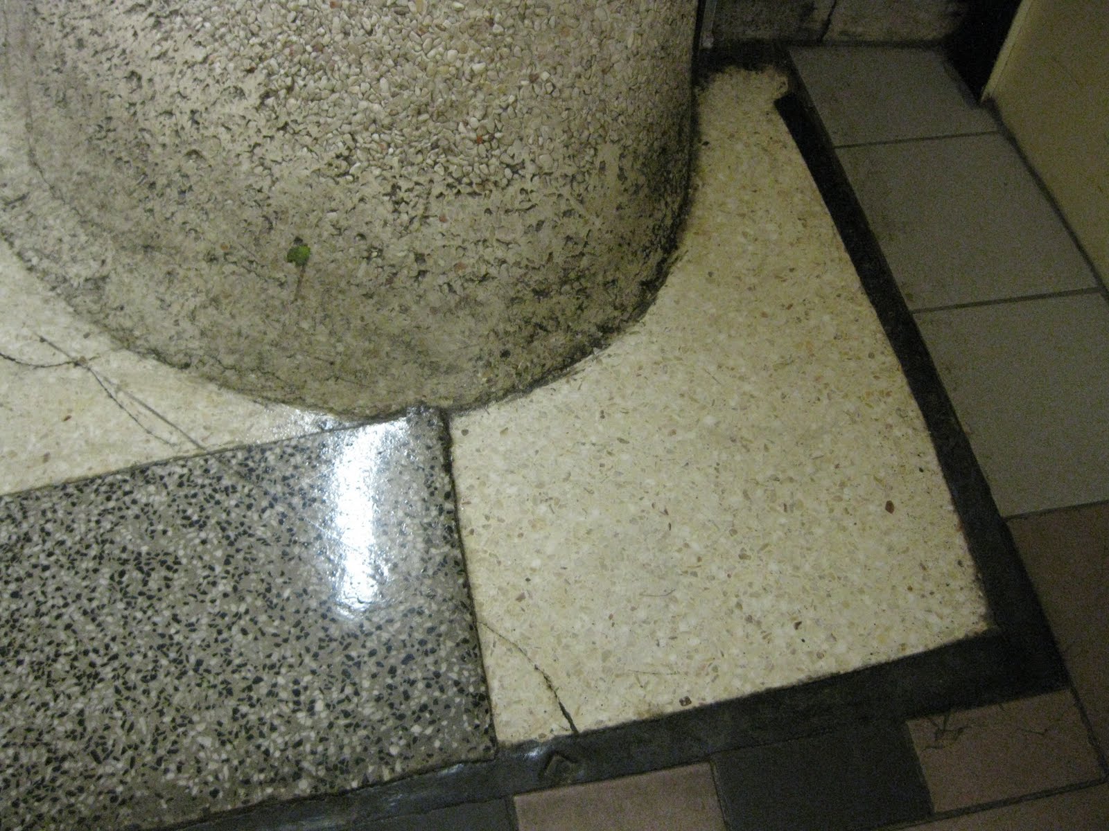
By the way, one of the most interesting things about white textured stone as a wall covering is that it's a work in progress, especially when joined to the floor in a curving swoop. For instance, how long as this wad of gum (that green splotch at about 10 o'clock) been stuck there? Will it ever be removed, or will it be joined by something else?
If you stick your gum there, take a picture and send it along!
Subscribe to:
Posts (Atom)