Showing posts with label Washington. Show all posts

Sunday, December 11, 2011

Union Station, Washington, D.C.: Pardon Our Appearance


Union Station in Washington, D.C. is one of the nation's great downtown train and transport terminals. An easy walk to the U.S. Capitol and the White House, it offers long-distance service to New York and New England as well as Chicago, Atlanta, Florida, and New Orleans. And the exterior of the 1907 structure (see above and below) is as impressive as it gets.


But the interior, alas, is currently a mess. A visit to the station's massive waiting room on Wednesday, Dec. 1 found endless stretches of black netting hanging from the vaulted ceiling, creating the effect of walking underneath an enormous trampoline. In other places, scaffolding is going up, obstructing passages and obscuring views. Check out these less-than-inspiring vistas:


The reason, of course, is that Union Station was among those landmarks that sustained damage in an earthquake this past August. (The Washington Monument was another, and remains closed to visitors.) At Union Station, the quake prompted repair work that's expected to take up to 10 months to complete.

So the entrance lobby, with its barrel-vaulted ceiling curving nearly 100 feet overhead, now looks as if a trapeze act is about to take place there. Well, with chunks of the plaster ceiling either fallen away or getting ready to let go, what choice did they have? And if you can't wait to experience the station's full grandeur, a sense of it is still provided by the station's "Western Hall," which remains undamaged:


And I've just read an item in the Washington Post from Dec. 7 (after my visit) reporting that crews are beginning to erect yet more scaffolding to make the repairs. That's on top what was already there when I passed through, such as this in one of the passageways from the waiting room to the ticket area:


This doesn't help the ticket area, which was once an impressive space just like the waiting room until it was filled with two levels of retail shops. Not only do these obscure the space's original proportions, but they make it hard to find the actual Amtrak ticket counters, which are buried somewhere underneath all this.


What's the point of having a vaulted roof when the space below it is filled with several levels of stores? While there's not much that can be done to restore the ticket area's proportions anytime soon, at least the netting and scaffolding will eventually go away.

In the meantime, one other thing that I also hope goes away is the practice of the station's retail outlets playing loud pop music to attract customers. This may be okay in a mall location, but it destroys the ambiance of a large and historic transportation terminal. It's a real distraction, and seems completely at odds with a century-old edifice.

In this case, the culprit was 'Little Miss Matched,' a small store along one side of the terminals's main waiting room. It wasn't even 11 a.m., and the store manager had a bouncy, hypnotic pop dance number going at moderate volume, which was enough for it to echo all around the big space—so much so that it was hard to know where it was coming from. (It took me several minutes to trace the source.)

It was bothersome enough for me to go into the store and ask the manager if it was corporate policy to play loud music during business hours. He said yes, so I told him: this terminal is a masterpiece of Beaux Arts design, and it was a shame that one retailer should be allowed to diminish it with noise pollution.

I got a blank stare, which was what I expected, but at least I told someone what I truly thought. How ironic that the name of the business is derived from the term "mismatched."

Regarding Amtrak, the station's main tenant: other than the hidden counters in the ticketing hall, Amtrak has surprisingly little presence in the station's signature spaces. Most of the railroad's passenger functions take place behind the back wall of the historic station, in a dismal concrete-and-steel space that sports a small curving roof to let in some natural light but not much else to distinguish itself.


Sad that Amtrak is treated by a poor step-child in the station's current layout, stuck out back in a seemingly unfinished space (though no work seemed to be in progress) that has all the ambiance of a warehouse outlet. Weird: the latticework supporting the roof harmonizes well with the temporary scaffolding in the station's other parts. I suppose we should be grateful that at least a few of the original station gateways are still in place, standing tall among the station's fast food outlets, though not serving any purpose:


Washington Union is also served by the city's Metro, so what about that? Here's one opinion I pulled off a blog, which describes the Metro as the "most iconic" transport system in the U.S.: "Like the monuments and museums of Washington D.C., the Washington Metro is a landmark of design, history and progress in America. For visitors to The Beltway, a trip on the Washington Metro often inspires as much awe and wonderment as the trip’s destination."

Huh? Who in their right mind would ever regard the Washington Metro as inspiring? The service may do its job, but the underground stations themselves are outstandingly ugly and oppressive. Shaped like squashed tubes and surfaced in a concrete brutalist waffle pattern, the dimly lit platforms would seem right at home as part of the dreary underground workers' city in 'Metropolis,' the German sci-fi silent film.


So these stations, all designed in the same dehumanizing way by modernist architect Harry Weese, are supposed to be inspiring? All I can say is that the only inspiration I'd expect from spending time in places such as this would be to jump in front of the next train and end it all.

And yet here's more crap from the same blog: "The underground stations of the Washington Metro are a captivating sight, a collection of grand caverns with curved, patterned ceilings and no direct light. There’s an almost alien feel to their design, one that inspires silent appreciation while the trains rumble in the distance."

Well, to get that taste out of our mouth, let's end with a shot of what a train station can and should look like—in this case, another exterior shot of Union Station, currently sporting some seasonal decorator touches.


Merry Christmas to all, and to all a good night. Except if you work for Little Miss Matched in Union Station, that is.

Tuesday, December 6, 2011

Washington National: Of Crash Gates and Coffins


I'll say it right up front: Washington's National Airport is one of my least favorite anywhere. I've been through it a couple of times, and the ambitious main terminal, designed by Cesar Pelli and opened in 1997, leaves me cold. It's all empty gesture and lost opportunities, I think. A flight I took into National on Dec. 1, 2011 confirmed my past impressions: the place seems to go out of its way to quash any excitement about air travel.

Not that Pelli didn't swing for the fences. To create a completely new terminal worthy of the downtown airport of the nation's capital, he came up with a long multi-level main concourse with a huge glass wall that framed three gate piers, the busy airfield beyond, and the many landmarks of Washington D.C. across the Potomac.

Not a bad plan, and impressive in terms of how he got the big new facility, known for some reason as both Terminal B and Terminal C, to fit snugly into the airport's constrained footprint.

So why does this place not do it for me?

A big reason is all the horizontal lines used everywhere in the design. Stretching across windows and walls from floor to ceiling, they create a prison-like atmosphere, as if Pelli's main thematic inspiration was that ubiquitous symbol of urban angst, the crash gate. And the net effect is to uglify the space.

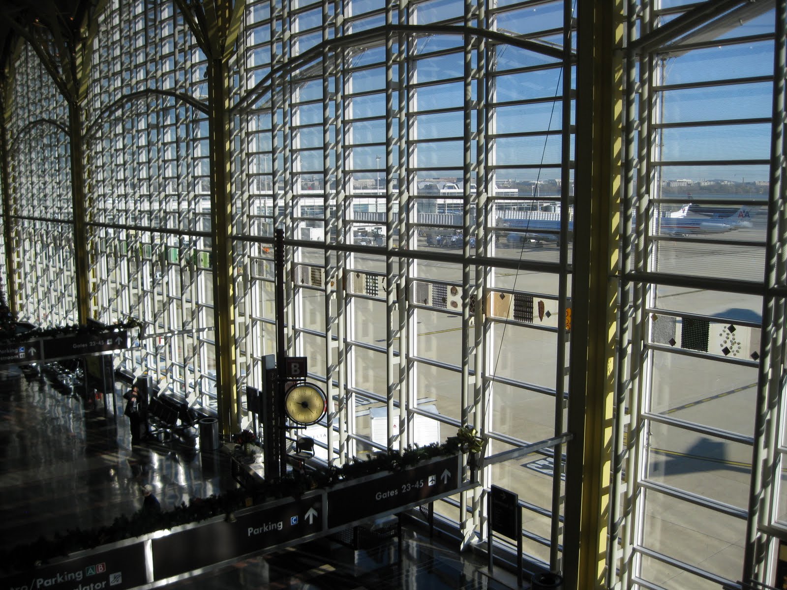
Just look at how the horizontal lines weigh down the terminal's big glass windows that look out onto the tarmac:


We have these enormous windows bringing us out onto the field and letting us see for miles, showcasing aircraft and action, and potentially lending a sense of excitement to the experience of flying in or out of the city. So why clog up the views with heavy horizontal lines that serve no structural purpose? The potentially inspiring vistas are ruined by row upon row of bars that remind me of, yes, crash gates, or maybe the bars across the windows of passenger trains in India:


In India, the horizontal bars keep people from entering or leaving through the windows. At National Airport, the horizontal bars serve nothing more than an inane and dehumanizing design scheme that turns a potentially inspiring space into an ersatz Stalag 17.

What's wrong with horizontal lines and windows and spaces? To massively oversimplify, the vertical mimics the human form (we stand upright), while the horizontal negates it. We are a vertical race, and the vertical (in doors, in windows, everywhere) works in concert with our humanity. The horizontal does not. And I feel this distinction is especially important in a transportation hub if the aim is to create a space that celebrates the human component (the start or end of momentous journeys, the meeting of friends and family) as well as the inspirational: the dream and wonder of flight, which has tragically vanished from commercial aviation today, at least in the United States.

Put another way: Vertical lines and spaces uplift and inspire. Horizontal lines and spaces inhibit and imprison. Back at National, consider the use of horizontal lines encasing these escalators:


Not only do Pelli's horizontal shapes mimic the dimensions of a human coffin, but, incredibly, many here are filled with a frosted material that blocks the view to the outside. Trying to add to the uncertainty of the experience, or make people feel they're in a prison? Mission accomplished.

So, although the scale and intentions of this facility are laudable, the details render it truly depressing. Consider the "horizontal coffin" motif as employed when travelers first arrive at the main terminal for a flight:


What kind of an inspiring welcome is this? Does it say "magic miracle of flight" or "abandon hope all ye who proceed?" People arriving at National for the first time, confronted by these blank walls with the small horizontal slit of glass, are made to feel like they're entering not an airport, but a federal penitentiary.

The horizontal coffin motif continues everywhere, overrunning the terminal like architectural kudzu. Look what it does to a long connecting walkway, hemming you in and interrupting the view:


And here it is cladding the control tower, for Pete's sake, making it look like some kind of giant-sized ribbed sex toy:


Worst of all, I think, is how this horizontal coffin motif obstructs the main terminal's large windows that overlook the busy tarmac. Instead of bringing passengers closer to the action, the windows act now as a barrier, as if to say, "In no way is the experience you're about to have worth looking at or savoring, even for just a moment."

It's all made worse, if you can believe it, by public art. Apparently what's going on outside on the airfield is so uninteresting that a strip of abstract designs must run across the entire length of the window, further obscuring the view.


Geez, I don't know honey -- are there planes out there somewhere? And if public art isn't enough, the windows are further obscured by sales kiosks and info booths and video screens that further mar the concept and take up valuable ground-level space.


It's bad enough that the windows are so blocked up, but even the terminal's potentially impressive interior space is diminished by unnecessarily heavy ground-level signage that spans the entire corridor and obstructs the vistas:


The only place where you get a real sense of the building's impressive scale is from the ticketing and check-in area on the second level, which at least brings your eye in above the signage and allows you feel like you're entering a worthy cathedral of transportation, a place where great journeys originate or conclude:


However, it also brings you in close to the terminal's bizarre and intimidating ceiling design, which is festooned with alarming shapes that somehow remind me of the "fizzy lifting drink" testing facility in 'Willy Wonka and the Chocolate Factory' (1971):


These oversized sheet metal leaf clusters might be intended to represent flight, but instead they serve to make a person feel tiny as they seem about to collapse right on top of you. And how about those "Jeffersonian domes" that make up the ceiling? I read where Pelli was trying to create something that harmonized with other architecture in Washington, but someone should have realized that the domes, with their portholes and archways, lose their singular purpose of focusing a space when they're placed one after another after another in a long row. Sheesh!

Speaking of the desire to "harmonize" with Washington, D.C., all the rest of it seems to be empty gesture. Take, for example, the recurring motif of the "false arch," which not only further clutters the terminal's main windows, but also weighs down entranceways and walls like this:


It's like a cartoon version of our nation's capitol. The fax five-sided arches are even applied as outdoor canopies in the lower level, even though the space is already completely shielded from the elements by the overhead roadway:


Speaking of harmony, right near this area is a retail space that's been built out in a style that's completely at odds with Pelli's post-modern structural homage:


Oops! Ironically, the faux column is more in harmony with a lot of Washington's federal architecture than anything in Pelli's terminal. Even Pelli's colors seem odd: what do hues of caramel and light blue have to do with Washington, D.C.?

A deliberate effort was made to incorporate public art into the facility, which is nice, but the execution is dismal. Consider this mosaic on the terminal floor, which is not noticed by people who walk over it and is too detailed for anyone on the balcony above to make any sense of:


The way people blithely walk over it reminds me of how Saddam Hussein once had a portrait of the first George Bush in an entryway of one of his homes as a sign of contempt. Here, it's like someone who hates art figured out the most ineffective way to display it to confirm its uselessness: "So you want art? There's your art! Hope it makes you happy!"

And there's so much else, although not all of it is a function of the terminal's design. How about the position of these seats at the edge of the balcony. Not only do the railings block any kind of view you might have to the crash-gate windows beyond, but the issue of legroom is no longer confined to the aircraft cabin, apparently:


And there's at least one really nice feature that you don't often see. Too often, baggage claim areas have the ambiance of sub-basements, making for a rather dim arrival. But in a few places, National's baggage areas are open to the terminal above.


This is a welcome breath of fresh air. Unfortunately, it's in a terminal that's otherwise oppressive and weighed down by empty gestures.

But wait! Maybe I'm missing the point. In this age of "less government is better," perhaps Pelli's terminal is ironic commentary on the ultimate ineffectiveness of federal government. Perhaps the endless repetition of horizontal coffin shapes that resemble banks of crash gates are meant to symbolize...oh, never mind.

Take it all in, and what should be an inspiring space makes one feel as if one is a gerbil making one's way through a Habitrail complex. You feel constrained, not liberated. You feel hemmed in, not ready to fly. What a missed opportunity, especially when a wonderful old-school example is just next door, in the form of the original pre-jet age National Airlines Terminal, now spiffily restored and often rented out for functions, as it was the day I passed through.


Look at the difference! The space, though on a smaller scale, is far more impressive and substantial. The vertical showcase the airside activity, practically inviting you to step through and onto the tarmac, as opposed to the Pelli terminal's cage-like effect. The simple ceiling, rather than festooned with sheet metal gimmickry and meaningless "Jeffersonian domes" that cancel each other out, does not draw attention to itself at all, and is far more satisfying. Less is more. It's orderly and inspires confidence. And the slight curve of the space (and the window) does more to create energy than a ton of public art.

Sadly, the remaining "non-modern" part of National (I just can't bring myself to call it "Reagan National Airport" because that just sounds silly to me) is probably the very worst airline space on the U.S. east coast. Known as 'Terminal A," it's like a directory of outdated contemporary design trends of about 40 years ago, all pre-formed concrete and textured stone wall covering and weird disturbing shapes that seem to have melted in place:


Yes, I like to see the process of getting to a departure gate as similar to getting sucked through the bowels of an abominable snowman:


What once might have evoked the splendor of the pre-deregulation jet age is now a tired shell that's slated, mercifully, to be torn down and rebuilt. In the meantime, hurry on down to National to see vistas such as this:


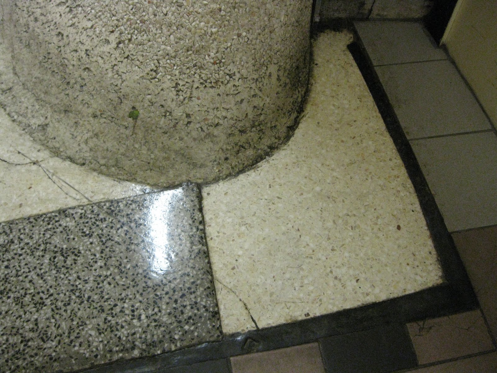
By the way, one of the most interesting things about white textured stone as a wall covering is that it's a work in progress, especially when joined to the floor in a curving swoop. For instance, how long as this wad of gum (that green splotch at about 10 o'clock) been stuck there? Will it ever be removed, or will it be joined by something else?


If you stick your gum there, take a picture and send it along!